


TL;DR: If your Webflow site is slow on mobile but fast on desktop, the problem often comes down to how mobile devices load and process website resources. In this guide, you’ll learn why mobile performance differs from desktop performance, the most common causes of slow loading, and the practical steps you can take to improve your site’s speed and user experience.
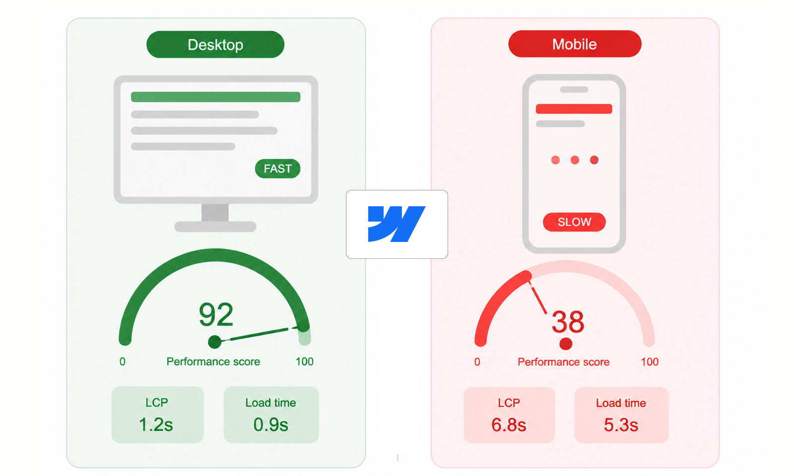
If you’ve ever run your website through PageSpeed Insights and noticed a frustrating pattern, excellent desktop scores but disappointing mobile scores, you are not alone.
One of the most common complaints among Webflow users is: why is the Webflow site slow on mobile but fast on desktop?
At first glance, it can seem confusing. The same website loads quickly on a laptop, yet feels sluggish on a smartphone. The reality is that mobile devices operate under very different conditions. They often have slower processors, less memory, smaller screens, and less stable network connections. As a result, a site that performs perfectly on desktop may struggle on mobile.
The good news is that most Webflow mobile speed issues can be identified and fixed through proper website speed optimization techniques without completely redesigning your website.
Quick Fixes: What’s Slowing Down Your Webflow Site on Mobile?
Why Mobile Performance Is Different From Desktop Performance
The simple answer is that mobile devices have less processing power, memory, and network stability than desktop computers. As a result, the same Webflow site can load quickly on a desktop while feeling noticeably slower on mobile.
This happens because mobile browsers must render layouts, process JavaScript, and load images using more limited hardware and often slower cellular connections. Even though Google’s Core Web Vitals standards are the same for both desktop and mobile, mobile devices generally take longer to handle the same resources and page elements.
That’s why a site that appears fast on a desktop can still experience Webflow mobile speed issues, especially if it contains large media files, animations, or multiple third-party scripts.
Understanding this difference is the first step toward diagnosing why your Webflow site is slow on mobile but fast on desktop.
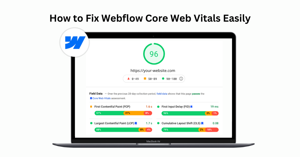
Why PageSpeed Insights Shows Different Mobile and Desktop Scores
There’s a good chance you’re looking at Google PageSpeed Insights results to check your webflow mobile and desktop scores.
PageSpeed Insights tests mobile and desktop performance differently. Mobile tests simulate a mid-range smartphone running on a slower network connection, while desktop tests assume more powerful hardware and a faster connection. Because of this, the same page can score significantly lower on mobile even when the content and design are identical.
This doesn’t necessarily mean your website is broken. Instead, it highlights how real mobile users may experience your site under less-than-ideal conditions. Large images, animations, JavaScript, and third-party scripts often have a greater impact during mobile testing, which is why mobile scores are usually lower than desktop scores.
Common Reasons Your Webflow Site Is Slow on Mobile but Fast on Desktop
If your Webflow site is slow on mobile but fast on desktop, several underlying factors could be responsible. Understanding these common bottlenecks will help you identify and fix Webflow mobile speed issues more effectively.
Large Images Are Usually the Biggest Problem
In many Webflow projects, oversized images are one of the most common reasons a site loads slowly on mobile. For example, a hero image uploaded at 3000px wide may look great on a desktop. However, mobile users often only need a fraction of that size. If the device still downloads a large image, it wastes bandwidth and processing power.
Media assets account for the majority of page weight on many websites, making image optimization one of the highest-impact performance improvements available.
How to Fix It
- Matter for user experience
- Matter for conversions
- Matter in competitive SEO environments
- Matter more on mobile-heavy websites
- Matter as supporting signals
But they are not stronger than:
- Resize images before uploading.
- Use WebP or AVIF formats whenever possible.
- Enable responsive images.
- Avoid uploading unnecessarily high-resolution assets.
- Lazy-load below-the-fold images.
Lazy loading prevents non-critical images from loading immediately, reducing initial page load times and shortening the critical rendering path.
Too Many Animations Can Hurt Mobile Performance
Webflow makes it incredibly easy to create beautiful animations. However, what looks smooth on a MacBook Pro may not perform as well on a mid-range smartphone.
Scroll-triggered animations, parallax effects, complex interactions, and multiple simultaneous transitions require continuous rendering work from the browser. On weaker mobile devices, this can cause lag, stuttering, and slower page responsiveness.
Common Animation Problems
Scroll-Based Interactions: Multiple elements animating on every scroll event can increase CPU usage.
Heavy Lottie Files: Large animation files often increase download size and rendering workload.
Excessive Motion Effects: When dozens of elements animate simultaneously, mobile browsers must constantly recalculate layouts and repaint content.
Best Practice
Reserve animations for areas where they genuinely improve the user experience rather than decorating every section. Consider accessibility in designs and follow thoughtful motion and animation practices to maintain mobile website performance.
Third-Party Scripts Are Often Hidden Performance Killers
Many Webflow websites rely on external tools such as:
- Analytics platforms
- Chat widgets
- Heatmap software
- Marketing automation tools
- Cookie consent tools
- A/B testing software
Each additional script introduces more JavaScript that must be downloaded, parsed, and executed.
Mobile devices typically execute JavaScript much more slowly than desktops, which means script-heavy pages often experience significant performance degradation on smartphones.
How to Fix It
- Remove unnecessary third-party scripts.
- Delay non-critical scripts from loading immediately.
- Consolidate overlapping tools where possible.
- Regularly audit integrations for performance impact.
Even a few third-party script optimizations can significantly improve Webflow mobile page speed
Fonts Can Slow Mobile Loading More Than You Think
Custom typography improves branding, but font files add extra network requests. A typical Webflow site might load:
- Multiple font families
- Several font weights
- Italic variations
- Variable fonts
Every additional font increases download size and rendering complexity.
Many Webflow developers identify fonts as a major contributor to poor mobile performance scores, especially when multiple families and weights are loaded simultaneously.
Optimization Tips
- Use fewer font families.
- Limit font weights.
- Remove unused font variations.
- Prioritize system fonts when possible.
Videos and Background Media Can Create Mobile Bottlenecks
Background videos often look impressive on desktop, but can significantly impact Webflow mobile performance.
Even compressed videos require more bandwidth and processing power than static images. If a background video serves primarily as decoration, consider:
- Replace it with a high-quality image on mobile.
- Loading videos only after user interaction.
- Reducing video resolution and file size.
For many websites, this single change noticeably improves mobile website speed.
Render-Blocking Assets Delay Mobile Performance
A common reason for poor Webflow mobile page speed is the presence of render-blocking resources. When CSS files, fonts, or JavaScript must load before content can appear, users experience delays before seeing anything useful on the screen.
Warning Signs
- Slow Largest Contentful Paint (LCP)
- Delayed text rendering
- Blank screens during loading
Tools such as Google PageSpeed Insights and Lighthouse can identify specific resources causing these delays.
How to Diagnose Webflow Mobile Speed Issues
Instead of guessing, use these performance tools to identify actual issues:
Google PageSpeed Insights: Provides both real-user data and performance recommendations to identify mobile speed bottlenecks.
Lighthouse: Generates a detailed performance audit highlighting issues related to loading speed, accessibility, SEO, and best practices.
Webflow Site Health Scan: Webflow’s built-in health scan helps identify performance, SEO, and optimization issues affecting site speed. Focus on metrics such as:
These metrics help reveal whether images, JavaScript, fonts, or layouts are causing problems.
Conclusion
If your Webflow site is slow on mobile but fast on desktop, the issue is usually caused by resource-heavy elements that mobile devices struggle to process efficiently. By optimizing images, reducing unnecessary scripts, simplifying animations, and monitoring Core Web Vitals, you can improve Webflow mobile performance and deliver a faster experience for both users and search engines.
FAQs
Q1. Why is my Webflow site only slow on mobile?
Q2. Can animations slow down a Webflow site on mobile?
Q3. Do large images affect mobile performance more than desktop?
Q4. How can I improve Webflow mobile speed without changing the design?
Q5. Can third-party apps and scripts slow down my Webflow site on mobile?
About the Author