


TL;DR: Most users are browsing your website from their smartphones, so optimizing your Wix website for mobile is essential. A mobile-friendly website not only enhances user experience but also strengthens your site’s search rankings and conversions. Delve into the simple and effective ways to improve your Wix website’s mobile performance, using the Wix Mobile Editor and other effective ways mentioned here.
In this mobile-first world, who doesn’t love scrolling and shopping on phones? From scrolling social media to taking pictures and from editing to shopping, everything can be done by this advanced device in no time. No wonder people spend a lot of their time on their smartphones.
Half of the global web traffic comes from mobile devices, according to Statista. In September 2025, mobile devices (excluding tablets) accounted for over 60% of the world’s web traffic.
This means your website content must display properly on a small screen. There comes the need for Mobile optimization, which incorporates making your website responsive and adaptable so that its layout displays correctly on a small screen.
You should ensure that mobile users can get easy navigation and have a seamless experience on your site. In this article, we are discussing how to optimize your Wix website for mobile devices and gain maximum customer engagement.
What Does a Mobile-Friendly Website Mean?

A mobile-friendly website refers to a website version that is specifically optimized to function efficiently on handheld devices like smartphones and tablets. Your mobile website must be capable of fully functioning and maneuvering on smartphones and tablets. As more than half of users currently access the website using mobile devices, it is no longer optional.
Mobile sites streamline complex pages for smaller screens, provide faster loading speeds, and seamless performance even on a slower internet connection. The mobile-responsive design adjusts seamlessly with every device and screen size.
Mobile-Friendly Features:
- Responsive Design: Your website automatically resizes to any screen dimensions
- Adaptive Design: Varies layouts of the site based on the accessing devices
- Mobile First Approach: The site is designed for mobile devices initially, and later adjusted for desktops.
- Dynamic Serving: The website sends different content to a mobile device than to a desktop.
- Separate Mobile Site: A completely different mobile version of the site.
Simple Steps to Optimize Your Wix Site for Mobile in 2025
Optimizing your Wix site on mobile not only improves your ranking but also enhances user experience and conversion rate. Here’s how you can implement Wix mobile optimization by following these simple steps:
1. Utilize the Wix Mobile Editor

Wix has mobile editing features offered by the Wix mobile editor. This feature automatically creates a mobile version of every web page of your Wix site. Through the mobile editor, you can make changes to the design of a webpage, eliminate or adjust some of its elements, scale or reposition certain features, as well as hide or relocate some features on your website. Each of those changes will not influence the desktop format of the website.
The Wix mobile editor allows you to adjust your site according to mobile screens. Follow the steps below to achieve this.
Step 1: Log in to your Wix account and open the website editor.
Step 2: The Wix Editor’s default configuration is in Desktop View. You will need to switch to Mobile View. So, while in the editor, click on the mobile icon located on the upper left and select the mobile editor.
Step 3: Use the features in the editor to customize your Wix site to meet mobile design standards. Remember, your changes will only determine how your site displays on a mobile device and not on a PC or laptop.
Step 4: The Mobile Settings tab lets you manage the Mobile View Options. You should turn on the Optimize Mobile View feature.
Step 5: Use the Preview feature to experience the mobile device view of your site.
Step 6: And finally, publish your changes.
2. Mobile-First Approach
A mobile-first design means designing user experiences for mobile phones before designing for desktops. With this approach, you ensure that your Wix website is optimized for small screens and will be responsive as the screen size increases. This aligns with the mobile user-first philosophy, which suggests that most of your audience is browsing your site from a mobile device.
3. Mobile-Friendly Template
A responsive layout means your site will adapt to different user device sizes. Responsive designs align with the diverse devices and will not make the site lag for users when loading from different speed screens.
A responsive site can improve your search rankings, as well as Google rewards mobile-responsive websites. Google algorithm ranks mobile-rendered pages higher, which means the competition is high for mobile-responsive sites.
4. Improve Website Speed
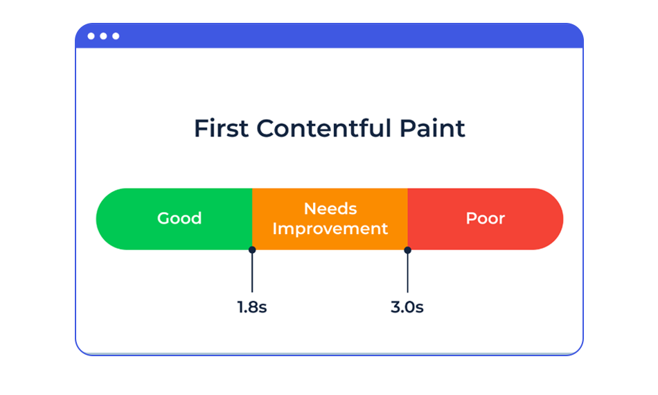
Page load speed is defined as the time taken for a page to load or respond when a user visits a specific site. Optimizing your Wix site on mobile is crucial for user experience, as a very slow-loading page can result in increased bounce rates and, in turn, reduce conversion rates.
Website speed influences rankings, so it is crucial to take the necessary steps to improve. With the help of analytical tools provided by Google, such as PageSpeed Insights, it is very easy to check your page load time.
5. Optimize Images for Mobile View

Images that take time to load on mobile devices can delay the loading of other content on a webpage, as mobile images have limited bandwidth. Additionally, mobile and even laptop users have data limits. Thus, optimized images load quickly and save mobile data usage.
The motive while optimizing images for mobile should be to keep the images as small as possible without compromising the quality.
6. Use Readable Fonts
Using basic, understandable fonts allows users to grasp information easily and encourages them to stay on the site. They also improve the professional appeal of the Wix site and increase the users’ trust in it. Plus, standard fonts look professional and easy to read on mobile devices.
Follow these strategies while choosing fonts:
- Standard fonts should be utilized
- Adjust font size for mobile
- High contrast font according to the Wix site background
- Maintain proper lines and word spacing.
7. Avoid Large Paragraphs for Text
Having large blocks of text can be difficult and boring for the user, creating disinterest. To make the Wix site text mobile responsive, it should be broken down into smaller texts, sentence spacing, bullet points, and numbering should be used for easy understanding. Add relevant headers that help readers quickly identify key points or sections.
Appropriate use of white space is crucial in writing. It is essential to make use of white space to separate text into logical sections. Each line separated by sufficient space can also make reading easier.
8. Adjust Buttons for Mobiles

Adjust button size and placement on your Wix site for mobile, keeping in mind that users have to press it with a thumb. Buttons are mostly placed at the top right corner of the page so that users can navigate them quickly when they open the site. That is exactly where you should put your CTAs.
9. Consider the Spacing of your Hyperlinks
The same issue comes with links just like buttons. The inability to accurately click a thumb link on a small screen is a common issue. Keep proper spacing between your links so that multiple links do not get clicked by the user.
10. Avoid using pop-ups
You already have a small screen to work with on mobile devices. Why make it even more closed with urgent pop-ups? It is also impossible to program a certain pop-up to show only in mobile usage. In addition, research has shown that pop-ups are the most hated form of advertisement. Don’t use them.
Conclusion
When it comes to optimizing your Wix website for mobile, it’s not just about how pleasant it looks—it’s about optimizing and improving the site’s speed, functionality, and overall experience for your visitors. Most web traffic comes from mobile devices. Therefore, your Wix mobile website could either ‘make it or break it’ for your online business. With the Wix Mobile Editor and the use of responsive website templates, site speed, image optimization, and custom mobile design, you can improve usability, engagement, and overall conversions.
Don’t forget that Google prioritizes mobile-friendly pages. Thus, having a mobile site enhances user experience, but also enhances your Search Engine Optimization. Try to make a few changes at a time, and it will reflect in your site’s traffic, bounce rate, and overall sales.
FAQs
Q1. Why is my Wix site slow on Mobile?
Q2. How do I make my Wix website mobile responsive?
Q3. How do I optimize images in mobile view on Wix?
Q4. How do I assess my mobile site performance on Wix?
Q5. Does Wix's mobile site speed affect your website SEO?
About the Author