


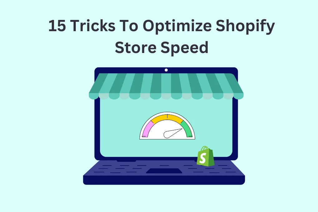
TL;DR: Improving your Shopify mobile speed boosts user experience, SEO, and sales. Optimize images, minimize apps, use a lightweight theme, enable lazy loading, and leverage browser caching to improve mobile speed for your Shopify store. Regular speed audits help keep your store fast and mobile-friendly for better conversions. Go through this comprehensive guide, including methods, tools, and advanced strategies for Shopify mobile optimization in 2025.
In today’s smartphone era, where everything is connected online, how quickly your website works on phones is very important and can’t be ignored. For Shopify store owners, improving Shopify mobile speed is especially important because more and more people are shopping on their phones, and many businesses get more than half of their visitors from mobile devices.
A slow mobile site could leave potential customers frustrated and head to your competitors. This can eventually hurt your business’s income. Research stated that 53% of mobile consumers will leave a website that takes longer than 3 seconds to load.
This comprehensive guide will help you explore 10 proven ways to enhance Shopify mobile speed, whether you’re new to the topic or working on enhancing an existing strategy.
The Importance of Mobile Speed Optimization
Before we get into the strategies for improving the Shopify mobile speed, it is of utmost importance to know why mobile speed optimization is needed for your store. Let’s break it down into three core reasons:
1. User Experience

A website that loads quickly enhances the browsing experience and encourages users to engage further. Mobile users have less patience nowadays, increasing the need to improve your Shopify store’s mobile experience. Sluggish websites can increase bounce rates and impact user interactivity, significantly. Thus, you can increase your chances of turning visitors into buyers with Shopify mobile speed optimization.
2. SEO Rankings
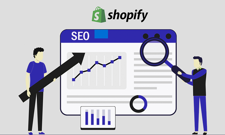
Google prioritizes fast-loading websites in its search engine rankings. With the introduction of Core Web Vitals, which focus on the user experience (such as loading time, interactivity, and stability), Google has placed even greater emphasis on page speed as a ranking factor. With optimized Shopify mobile speed, websites are more likely to rank higher in search engine results, which can lead to more organic traffic.
3. Revenue and Conversions
Research reveals that a delay of just one second in page load time can result in a 7% reduction in conversions. For every additional second of load time, conversions continue to drop. That means, if your online store earns $100,000 each day, a one-second delay in loading a page could lead to losing $2.5 million in sales every year. As mobile traffic continues to grow, optimizing your Shopify mobile speed becomes a direct way to boost sales.
10 Simple Methods to Enhance Shopify Mobile Speed
To ensure your Shopify store loads quickly and efficiently on mobile devices, focusing on various aspects of site optimization is essential. Here are the top 10 key methods to significantly enhance your Shopify mobile speed, improving user experience and increasing conversion rates.
1. Optimizing Shopify Images
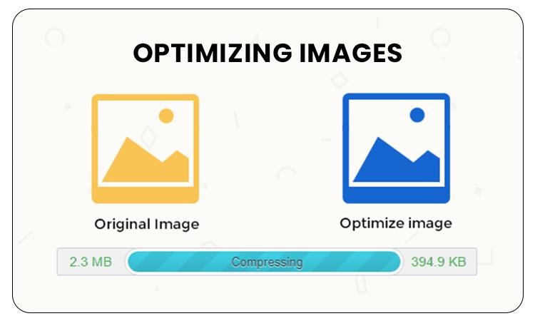
Images usually represent the largest part of a website and can cause drastic speed drops on the web pages, especially on mobile phones and networks with lower internet speed. High-resolution, uncompressed images can contribute to increased page size with subsequent increases in page loading time.
Why It Works: Optimized images are of small file size without loss of visual quality, and are much faster to load. Image compression and downscaling help to achieve a fast user experience, especially on mobile, where bandwidth is usually restrictive.
Implementation:
- Use image compression tools, such as Image Optimizer Pro, to compress image file sizes.
- Implement adaptive image sizes for responsive images that automatically scale down the images on mobile devices to a proper size.
- Implement lazy loading on images, so that they are only loaded when they are about to be visible in the user’s viewport.
2. Reducing JavaScript and CSS File Sizes

JavaScript and CSS files can have a negative impact on your Shopify store’s loading speed, especially on slow mobile devices.
Why It Works: Reducing the size of JavaScript and CSS files cuts down the amount of data that must be transferred to load them, improving page rendering. Less complexity in code also reduces the time taken to be parsed and shown by the browser.
Implementation:
- Use tools such as UglifyJS to optimize JavaScript files.
- Use an online tool to combine and shrink CSS files, which helps lower the number of HTTP requests.
- Delete any unnecessary CSS and JS files to make the overall file size smaller.
3. Fixing Render-Blocking Issues

Resources that block rendering, usually JavaScript or CSS, make a webpage take longer to display the main web content because the browser waits for these resources to load before showing any other website components. This can significantly enhance mobile user experience.
Why It Works: Removing or deferring render-blocking resources allows the page to render faster, improving the user experience and reducing the load time on mobile devices.
Implementation:
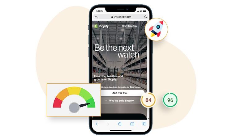
- Use tools like Google’s PageSpeed Insights or Lighthouse to identify render-blocking resources. Also, if you are really serious about your conversions, consider using a no-code DIY tool for long-term results and quicker conversions, like Website Speedy, which will automate the speed optimization process for your Shopify store.
- Move non-critical JavaScript and CSS files to the bottom of the page or defer them until after the main content loads. By effectively implementing this optimization, you can get up to 40% improvement in your website load time.
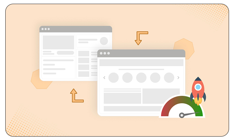
4. Implementing Mobile-First Design

Mobile-first refers to initially designing a website for mobile devices, and then adapting those designs for desktop use. It allows your site to display properly on a small display, even with poor mobile connectivity.
Why It Works: Mobile-first design enables you to concentrate on the most important features for the mobile audience while minimizing the number of non-essential features that can slow down your site. This approach favours performance over appearance, providing rapid mobile loading.
Implementation:
- Using responsive design ideas to fit different screen sizes ensures your Shopify store works well on any device.
- Show the most important information above-the-fold so people can see it quickly on mobile.
- Use simple themes that are made for mobile devices to make your store load faster.
5. Minimizing Redirects
Redirections are the HTTP requests that are used to send users from one URL to another. Even if they have to be used in some cases, redirects can slow down the site loading, particularly in mobile networks.
Why It Works: Each redirect means one HTTP request, increasing the load time significantly. Reducing the number of redirects is one way of reducing the loading time of the final page, increasing the render time as well.
Implementation:
- Audit your Shopify store for excessive redirects using tools like Redirect Mapper.
- Reduce the number of redirections by sampling the URL scheme.
- Improve all the redirect chains so that users are not repeatedly redirected to the final page before reaching it.
6. Using a Content Delivery Network (CDN)

A Content Delivery Network (CDN) keeps your website serving fast in various locations around the world. This system helps users to access your site from their closest server, which makes the site load faster and reduces waiting time.
Why It Works: CDNs reduce the distance between your site’s content and users, which improves page loading, especially for global Shopify stores.
Implementation:
- Use Shopify’s built-in CDN for assets like images, JavaScript, and CSS files.
- It is also advisable to use third-party content delivery networks (CDN) such as Cloudflare, which can provide even global delivery of content instantly.
7. Prioritizing Critical Content with Lazy Loading
Lazy loading is a technique that delays non-critical web elements, like images or videos, until they are needed. This means your website will load the information only if the user wants to see it in their viewport while scrolling a webpage.
Why It Works: By deferring the loading of non-critical media files, like heavy images and videos, you can significantly reduce initial page loading time. This method is useful in particular for users with slow mobile connections.
Implementation:
- Implement the built-in lazy loading functionality in Shopify or use a no-code tool, Website Speedy, for better results.
- Ensure that essential content (such as text or product details) is prioritized to load first, while the users scroll. By this optimization, you can single-handedly improve your website speed up to 25%.
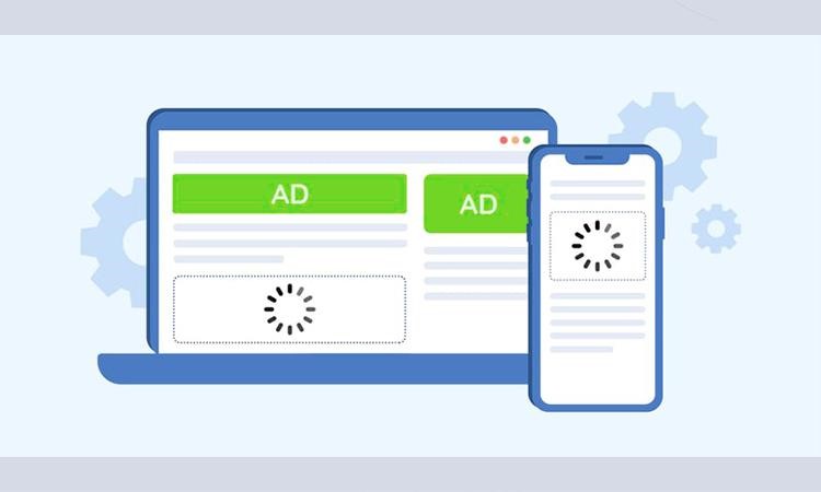
8. Optimizing Shopify Apps
Shopify apps can be helpful for adding functionality, but some apps can introduce unnecessary bloat and slow down your site’s performance, particularly on mobile devices.
Why It Works: Every app downloaded to a store can just add an extra layer of JavaScript, CSS, and even images that can lower site speed. Optimizing or removing unnecessary apps helps improve site speed.
Implementation:
- Regularly review the apps installed on your store and remove any that are not needed anymore.
- Replace bloated apps with lightweight alternatives that provide similar functionality.
- Use Shopify’s “App Speed Reports” to assess the impact of each app on site performance.
9. Implementing AMP (Accelerated Mobile Pages)
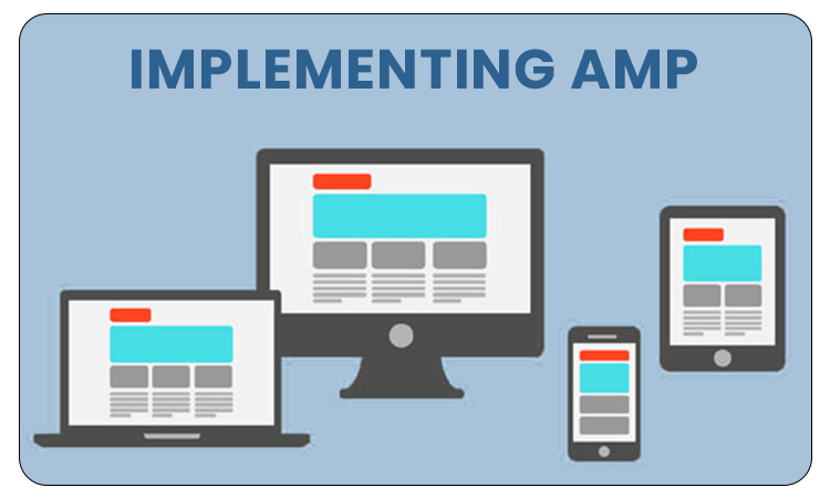
AMP is an open-source framework designed to provide fast-loading mobile web pages. It’s specifically designed to streamline content for mobile users, reducing the need for heavy elements that slow down performance.
Why It Works: AMP eliminates non-essential elements like heavy JavaScript and optimizes images to ensure fast loading. Implementing AMP can significantly improve your Shopify mobile speed and ensure an optimal user experience on mobile.
Implementation:
- Implement accelerated mobile pages on your store using Shopify’s AMP apps/third-party AMP solutions.
- Focus on serving only critical content on AMP pages, such as product information, images, and call-to-action buttons.
10. Asynchronous Loading of Resources
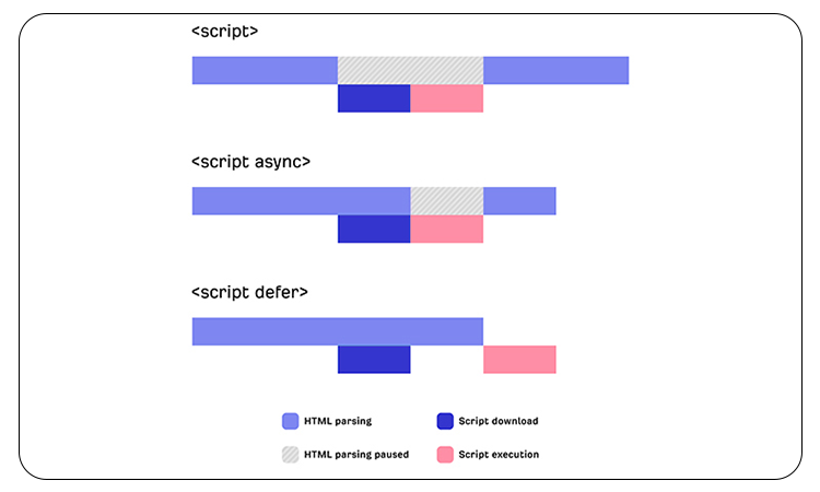
Asynchronous loading means that parts of a webpage, like JavaScript files or images, will load at the same time without making them wait for each other to load. This means the JavaScript files and web images will load asynchronously, without hindering the loading of other crucial web elements.
Why It Works: Delivering resources asynchronously prevents them from constantly affecting the page’s appearance. This helps the page load faster and serve essential content quickly to the users, especially on mobile devices.
Implementation:
- Use async and defer attributes for JavaScript files to ensure they load asynchronously without blocking page rendering. If you’re not very technical, using a no-code tool like Website Speedy is a good choice to improve your website’s performance and make sure it stays up-to-date in the future.
- Load non-essential scripts and assets after the main content has loaded. If you do it right, whether you use manual or automatic methods, you can expect the load time to improve by 25 to 35%.
By combining these Shopify speed optimization techniques, you can significantly improve your Shopify mobile speed. These methods reduce loading times, enhance user experience, and ultimately drive higher conversions, keeping mobile users engaged and satisfied.
Essential Tools to Check Shopify Mobile Site Speed
In optimizing your Shopify website for enhanced mobile performance, monitoring and analysis of the different performance metrics are vital to pinpoint areas of improvement. These popular tools can assist you in monitoring the performance of your site and can deliver actionable information:
Google PageSpeed Insights

Google PageSpeed Insights is an essential tool that evaluates your Shopify store’s performance and offers actionable recommendations for improvement. It measures multiple performance metrics to assess your site’s speed and usability.
Key Metrics Tracked:
- First Contentful Paint (FCP): This metric calculates the time it takes for the first visible element to appear on the screen. Aim for an FCP of under 1.8 seconds to provide a fast initial load time.
- Largest Contentful Paint (LCP): Tracks the time it takes for the largest piece of visible content to load. Ideally, you should aim for LCP to occur within 2.5 seconds or less.
- Cumulative Layout Shift (CLS): This metric measures how stable your layout is by tracking unexpected shifts in page elements. Keeping the CLS score under 0.1 ensures a visually stable site.
- First Input Delay (FID): This tracks the delay between a user’s first interaction with your site and the browser’s response. For optimal performance, aim for an FID score below 100 milliseconds.
- Interaction to Next Paint (INP): INP is a relatively new metric that measures how fast your website responds to user actions like clicks or taps. It replaced First Input Delay (FID) in March 2024 and focuses on overall responsiveness after a page loads. A good INP score is under 200 milliseconds, ensuring smooth user experience on your Shopify store.
- Speed Index (SI): SI measures how quickly content is visually presented. A score below 3.4 seconds is ideal for creating a seamless browsing experience.
Google PageSpeed Insights not only detects issues but also provides specific recommendations for improvement. For example, it may suggest image optimization, deferring non-critical JavaScript, and reducing resource requests to improve your Shopify store’s performance. Following these suggestions can drastically reduce loading times and improve your store’s mobile user experience.
GTmetrix
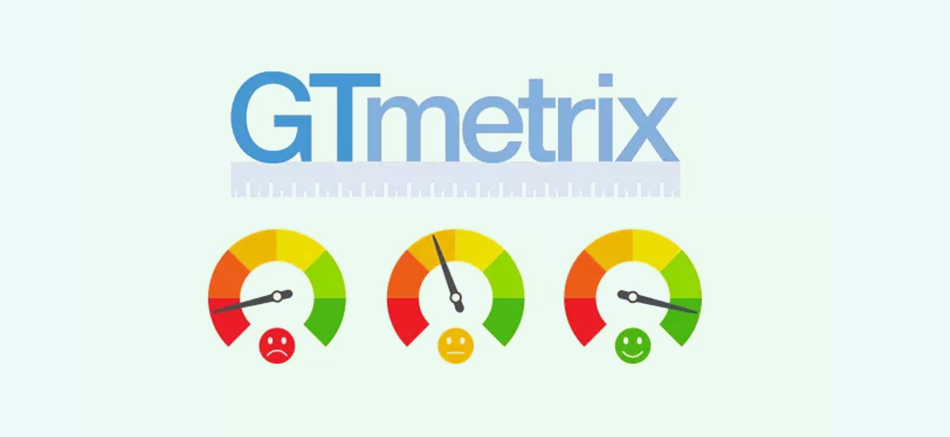
GTmetrix is also a powerful tool for performance analysis of your Shopify website. It provides a thorough breakdown of your site’s speed and offers actionable insights to improve load times.
Key Features of GTmetrix:
- Detailed Recommendations: GTmetrix offers specific advice on how to reduce load times, such as optimizing images, compressing files, and minifying CSS/JavaScript.
- Waterfall Chart Analysis: This feature presents a visual representation of your site’s performance in real-time, highlighting the elements or scripts causing load delays. It helps identify latency issues and focus optimization efforts on specific areas that can be improved.
- Performance Scores: With GTmetrix, it is possible to award a grade to the overall performance of your Shopify store, thus allowing you to evaluate the performance of your store in relation to the industry benchmarks.
- Previous Data: A notable property of GTmetrix is that it is able to monitor previous performance statistics. This is helpful for evaluating the effectiveness of optimization efforts over time, ensuring that your improvements are sustainable.
- Custom Alerts: According to GTmetrix, it is possible to implement custom alerts about performance degradations. This ensures that you’re promptly notified if your site begins to slow down, enabling you to take immediate action to address the issue.
Pingdom

Pingdom is a trusted web performance and uptime monitoring tool that provides real-time monitoring of how your Shopify store is working. It provides a number of distinctive features that are helpful in continuous monitoring of the mobile speed of your site.
Key Features of Pingdom:
- Global Testing: Pingdom tests your site’s performance speed from different geographical points of view, giving a detailed picture of your site’s performance in each area. Especially for the Shopify store with worldwide users.
- Detailed Performance Insights: Pingdom breaks down loading times for individual components of your site, such as images, JavaScript, and external services. The identification of slow-loading modules allows the selection of regions for optimization.
- Uptime Monitoring: Pingdom continuously monitors your site’s uptime and alerts you instantly if your Shopify store goes down. This feature ensures you can resolve any downtime issues as quickly as possible to minimize loss of sales.
- User Experience Metrics: Pingdom shares information about the behavior of the sites’ visitors. This data enables you to tune the user experience, delivering a faster and smoother mobile browsing experience.
- Customizable Reports: The tool generates detailed, customizable performance reports that you can share with your team. These reports help track your site’s performance trends and guide further optimization efforts.
How to Analyze Shopify Mobile Performance Metrics
For optimal mobile performance of your Shopify store, it is very important to run these tools in conjunction to measure a wide array of performance metrics and narrow the bottlenecks. Here’s how you can leverage each tool:
1. Run Regular Performance Audits: Regularly perform audits of store speed using Google PageSpeed Insights and GTmetrix. These tools will enable you to have a deep understanding of how your store performs and will offer you concrete recommendations for optimization.
2. Track Resource Loading: GTmetrix’s Waterfall Chart is invaluable for tracking resource loading in real time. It helps you highlight slow-loading scripts, images, and other elements, allowing you to prioritize optimizations.
3. Monitor Global Performance: If your Shopify store serves customers worldwide, use Pingdom to test your site’s speed from various locations. This will help you ensure fast load times for customers in different regions, improving your store’s global user experience.
4. Address Performance Issues Promptly: Use GTmetrix’s custom alerts and Pingdom’s uptime monitoring to stay on top of performance issues and downtime. These alerts allow you to act quickly and prevent slowdowns from affecting your mobile conversions.
By integrating these tools into your optimization strategy, you can ensure your Shopify store consistently performs well across devices and geographical locations, keeping customers happy and driving more conversions.
Tools for Shopify Mobile Speed Optimization
To help you optimize your Shopify store’s mobile speed, here are some essential tools that can assist in identifying performance bottlenecks and implementing changes:
- Google PageSpeed Insights: Tests your Shopify store’s mobile performance and gives Core Web Vitals data with practical improvement tips.
- Shopify Online Store Speed Report: Built-in Shopify tool that benchmarks your store’s mobile speed against similar stores.
- Lighthouse (Chrome DevTools): Runs a mobile performance audit directly in Chrome to assess loading, interactivity, and visual stability.
- Website Speedy: An advanced Shopify speed optimization app for implementing lazy loading, asynchronous loading, and fixing render-blocking issues to improve page speed and deliver a seamless mobile user experience. Go to the Shopify app store, look for Website Speedy, and you can easily download it to add to your store.
Conclusion
Mobile performance optimization is very important for staying ahead in today’s competitive and speed-driven market. A seamless, fast mobile experience is not just about enhancing Google rankings or boosting conversions but also about providing your customers with the smooth, engaging shopping journey they expect.
After employing all the above-discussed optimization techniques, such as asynchronous loading, lazy loading of elements, and eliminating render-blocking of resources, you can have a significant impact by accelerating mobile site speed and providing a faster, more responsive experience for the visitors of your site.
If you need further help in improving your Shopify mobile speed, feel free to ask us in the comments below. Our team will be happy to assist you!
FAQs
Q1. Why is mobile speed important for Shopify stores?
A fast mobile store improves user experience, reduces bounce rates, and increases conversions. Since most shoppers browse on phones, mobile speed directly impacts your sales and SEO rankings.
Q2. How can I check my Shopify store’s mobile speed?
You can use tools like Google PageSpeed Insights, GTmetrix, or Lighthouse to analyze your store’s mobile performance and identify elements that slow it down.
Q3. What are the most common causes of slow Shopify mobile speed?
Heavy images, too many apps or scripts, unoptimized themes, and unnecessary animations are the main culprits behind slow Shopify mobile performance.
Q4. Do Shopify speed optimization apps really work?
Yes, many apps can help compress images, lazy-load content, and reduce code bloat but relying solely on apps isn’t enough. Manual optimizations and theme tweaks often yield better long-term results.
Q5. How often should I test and optimize my Shopify mobile speed?
You should review your mobile speed monthly or after making significant design, app, or content changes to ensure your store continues to perform at its best.
About the Author