


TL;DR: Restaurant website mobile optimization is the key to boosting orders and improving customer experience. A fast, mobile-friendly restaurant website with clear navigation, optimized menus, and quick checkout can significantly increase online orders. Follow this guide for proven tips to improve orders and customer experience, and turn more visitors into loyal customers.
Stepping on a LEGO vs. losing a potential customer, the pain is almost the same in both cases. Mobile marketing is the new way that can help your restaurant get discovered by more customers. Why? Because data shows that more than 60% of the web traffic comes from mobile devices.
As many people are embracing contactless ordering services, restaurant website mobile optimization has become more crucial for food businesses. This article will walk you through the ways of optimizing your restaurant website for mobile users to enhance orders and customer satisfaction.
What is Restaurant Website Mobile Optimization

Designing and refining your website to perform flawlessly on smartphones and tablets is restaurant website mobile optimization. It’s about creating a seamless experience where visitors can easily browse the menu, place an order, or make a reservation, all without zooming, pinching, or waiting for pages to load.
A well-optimized site adapts automatically to any screen size, keeps images light and fast, and ensures actions like “Call Now” or “Order Online” are just one tap away. With most diners searching and ordering from their phones, a mobile-optimized restaurant website is essential for attracting customers and driving more orders.
Why Prioritize Mobile-Friendly Websites for Restaurants
Mobile traffic dominates everyday browsing. Visual Capitalist global statistics from August 2025 show that the majority of web traffic comes from mobile devices, making mobile performance essential for visibility and conversions.
Desktop vs Mobile Browsing Data 2021-2025
| Year | Global Desktop Browsing | Global Mobile Browsing |
|---|---|---|
| 2021 | 41.5% | 58.6% |
| 2022 | 42.5% | 57.5% |
| 2023 | 39.4% | 60.6% |
| 2024 | 39.8% | 60.2% |
| 2025 | 39.5% | 60.5% |
Moreover, Google evaluates and ranks sites using the mobile version of a page (mobile-first indexing), so a restaurant that ignores mobile optimization risks worse search performance and lower local visibility.
Common Mobile Website Issues That Hurt Restaurant Sales
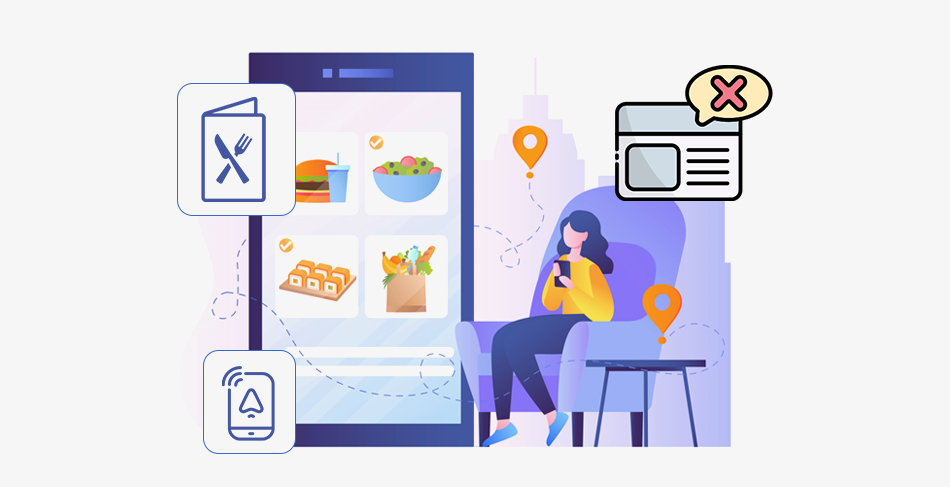
These common website issues on mobile collectively harm performance, lower engagement, and directly impact a restaurant’s ability to convert visitors into customers.
1. Slow Loading Restaurant Menus and Images:
Large or uncompressed images delay page loading, causing visitors to leave before viewing your menu, resulting in higher bounce rates and fewer completed orders. Although enticing images and a well-optimized menu are the most important features, a restaurant website should have. These are the first elements users interact with when they visit your site.
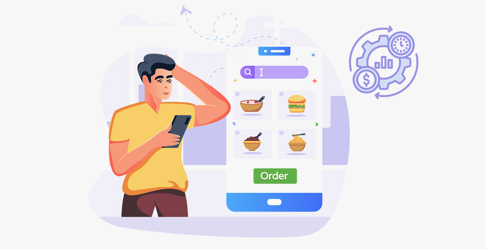
2. Poor Mobile Navigation or Cluttered Layouts:
Complicated menus or hidden “Order” and “Reserve” buttons frustrate users, making it harder to take quick actions and reducing your chances of converting mobile visitors.
3. Unresponsive Design Hurting Mobile Conversions:
If buttons are too small or layouts don’t adjust to screen size, users struggle to interact, creating friction that leads to abandoned orders and lost revenue.
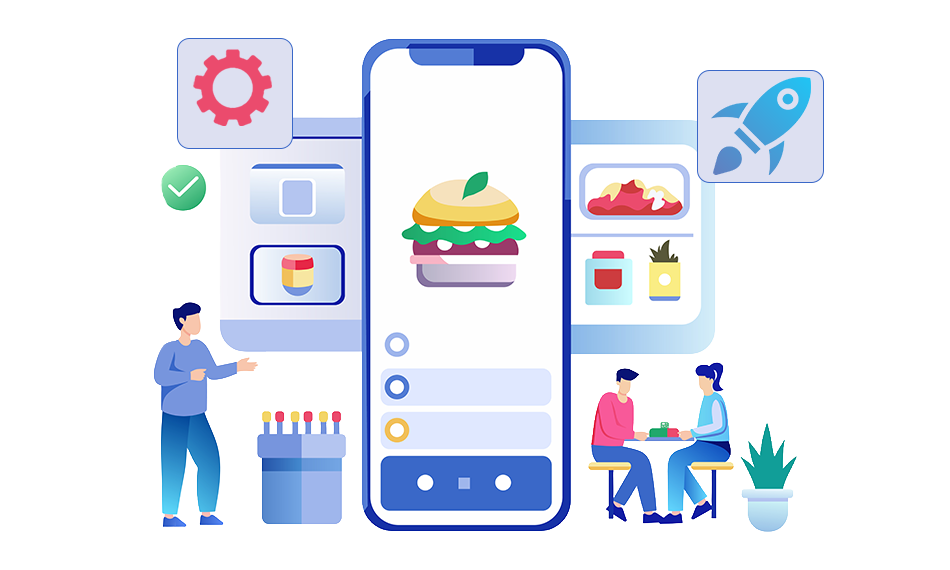
How to Optimize Your Restaurant Website for Mobile Users

To improve orders and customer experience, apply these 12 practical and proven restaurant website mobile optimization strategies:
1. Increase Mobile Navigation
Effective restaurant menu optimization starts with easy navigation. Simplify your restaurant menu design for mobile screens. Enhance navigation with a clean single-column layout with collapsible sections for categories like Starters, Mains, and Desserts. Include large, tappable buttons for key actions, and keep “Order Now” or “Reserve” sticky at the bottom for seamless access on mobile screens.
2. Optimize Technical Site Performance
Technical aspects, including speed, are non-negotiable for mobile optimization. Faster pages keep visitors engaged and boost conversions. Use image compression, browser caching, lazy loading, and a CDN to accelerate performance. For an easier approach, tools like Website Speedy can automate these optimizations by implementing caching, image compression, and lazy loading to improve mobile website speed for restaurants without needing technical expertise or developer support.
3. Get a Well-Optimized Mobile App for Your Restaurant
If your business model supports repeat orders and loyalty programs, a mobile app can greatly enhance the customer experience. A well-optimized app offers easy ordering, built-in SEO benefits, and personalized engagement.
Moreover, it allows you to use valuable customer data for sending push notifications and emails about special offers and discounts, ultimately increasing overall ordering capacity and customer retention.
4. Use High-Quality Food Images to Entice Customers
High-quality, optimized images increase click-throughs on dishes, but always resize and compress for mobile so images don’t become a speed penalty. It’s often said that ‘we eat with our eyes first’. Thus, add engaging photos to entice customers. Short clips of food-preparing and plating can also be helpful.
5. Optimize Your Online Ordering System
Offer an order flow with minimal screens and a visible progress indicator. Pre-fill address options for repeat customers, support guest checkout, and allow saving payment methods securely. Simplifying your reservation forms can also help with fast bookings.
6. Flexible Ordering Choices
Provide flexible order options, including dine-in, delivery, and pickup options, all accommodated in one place at ease. Offer a simple and clean interface, allowing customers to choose their preferred service type before ordering. Show things like waiting time, pickup readiness, and extra charges earlier to reduce confusion and frustration in ordering.
7. Streamline Checkout and Payment Process
Support multiple payment options (card, mobile wallets like Apple Pay/Google Pay), minimize required fields, and keep the cart visible so users don’t abandon it when costs change.
8. Visible CTAs, Buttons, and Contact Information
Large, contrasting “Order Now,” “Reserve,” and “Click to Call” buttons should be above the fold for mobile. Also include a phone number and a clear address with a map link. Buttons make mobile navigation easy, increasing chances of instant conversions.
9. Offer Exclusive Mobile-Only Deals or Loyalty Rewards
Mobile promos and one-tap discounts increase order frequency. Smart upsell prompts like “10% off on adding more to this order value”, “buy 1 get 1 free”, or “add drinks also” at checkout, raise average order value.
10. Social Media Integration
Link menus and specials to your social media pages and enable quick sharing. Social discovery often happens on phones, so keep profile links and posts up to date. Social engagement drives discovery and clicks to your mobile site. People often find out about restaurants and foods through ads.
11. Integrate Chatbots and Live Chat Support
A lightweight chatbot can answer common questions, like “where is my order?” or ” what are the wait times, reducing friction that otherwise causes potential customers to leave. This will also significantly reduce your restaurant call rush, diverting the customer to the chat facility.
12. Collect and Showcase Customer Reviews
Showcase short, mobile-formatted customer reviews near the menu and order button. Reviews influence conversions heavily in restaurant selection and ordering.
Additional Tips For Restaurant Menu Optimization
The menu is an important part of restaurant conversions. Along with restaurant site optimization, aligning your menu is also vital for improved UX and orders.
Prioritize Popular Dishes on Top:
Place your best-selling items first so mobile users quickly spot familiar favorites, reducing decision time and boosting overall online orders.
Use Visuals Strategically to Guide Choices:
Add small, optimized food images beside menu items to entice users without slowing load time, helping them make faster, more confident ordering decisions.
Keep Menu Sections Short and Scroll-Friendly:
Break long menus into simple, scrollable sections so users can browse easily on small screens without feeling overwhelmed or losing interest.
Conclusion
Restaurant website mobile optimization is a direct path to more orders and happier customers. By simplifying navigation, compressing images, streamlining checkout, and testing mobile performance regularly, restaurants can turn casual mobile visits into repeat diners and steady revenue. Prioritize the mobile experience as Google treats mobile as the primary version of pages, and diners are increasingly doing the same.
FAQs
Q1. Why is mobile optimization important for a restaurant website?
Q2. How does mobile site speed impact restaurant online orders?
Q3. How does mobile optimization boost customer experience for restaurant sites?
Q4. What are simple fixes to improve mobile ordering conversions on a restaurant site?
Q5. How can restaurant menu optimization improve mobile user engagement?
About the Author