


TL;DR: Like last year, mobile traffic dominates the web in 2025 as well, increasing the importance of Squarespace mobile optimization. Practical strategies like responsive design, website speed, easy navigation, and optimized web elements can help you make your Squarespace website mobile-friendly and improve rankings and user experience.
In this mobile-friendly world, spending even a day without a phone is impossible. Possibly, most of you are still reading this on your mobiles.
From the perspective of a digital world, your website is often the first thing consumers see about your brand. And the catch is that most people won’t even look at your Squarespace site on a computer.
A report from Statista (2025) stated that more than 61% of all internet traffic comes from mobile devices, which will surely go higher this year. This means that if you don’t optimize your Squarespace website for mobile, you’ll be left behind because of this change.
Why Squarespace Mobile Optimization is Necessary in 2025
Improving Squarespace mobile optimization is the critical aspect in 2025 for higher rankings, SEO, user experience, and conversions. It’s a must that you can’t ignore. Let’s explain why:
Google’s Mobile-First Indexing:
Google now ranks websites based on how well your website works on mobile devices. Thus, your SEO rankings could be hurt if you don’t optimize your Squarespace website for mobile.
User Behavior:
Research shows that people who use mobile devices scroll three times faster than people who use computers. If your Squarespace site isn’t set up to handle this, your bounce rates will get a boost.
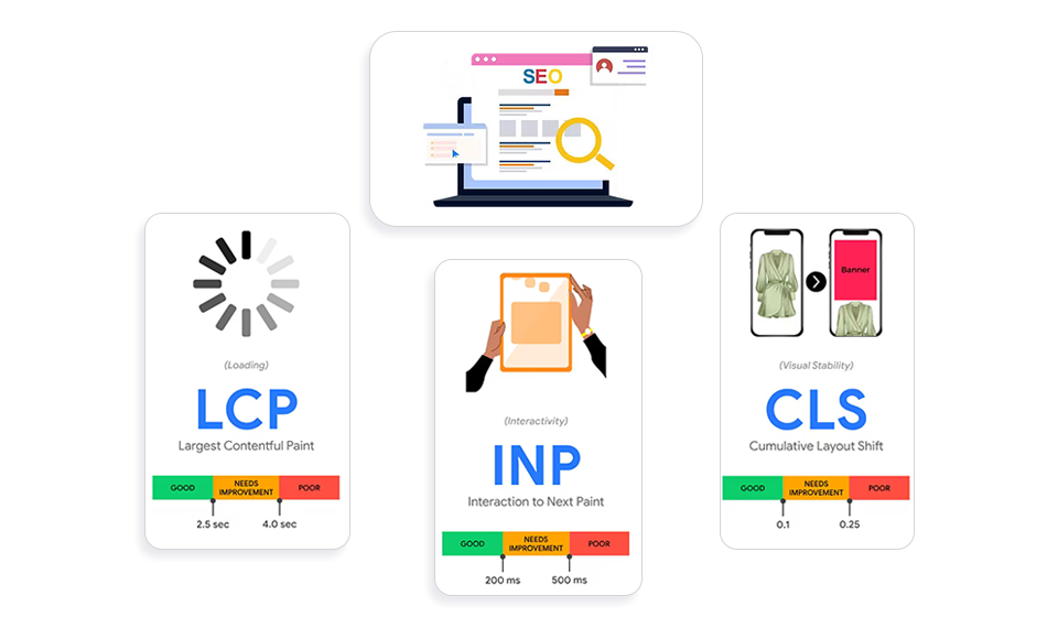
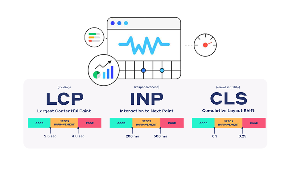
Core Web Vitals Affect:
Google keeps a tight eye on speed, stability, and engagement. Without Squarespace mobile speed optimization, your rankings and conversions are in danger right away.
Conversions on Mobile:
Mobile is the main source that people use to shop and scroll online, whether it’s for e-commerce or service bookings. If your site isn’t optimized well for mobile, you could miss out on significant sales chances.
In short, you need to prioritize mobile speed optimization for better conversions, and if you want to stay ahead of your competitors.
Must-Have Elements For an Optimized Squarespace Website for Mobile
Here are some must-have aspects for making your Squarespace Website mobile-friendly:
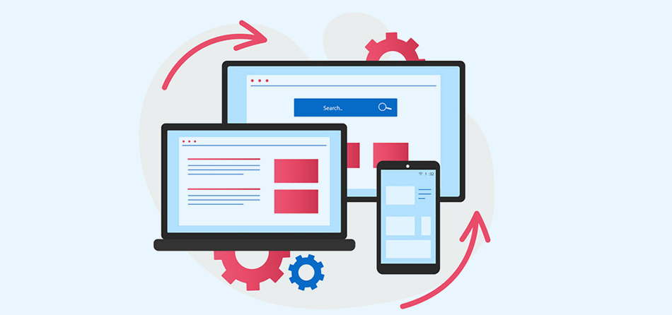
1. Responsive Website Design
A responsive website means that it will automatically adjust to any device, whether it’s a smartphone, tablet, or desktop, without changing the layout. This is a built-in feature of Squarespace, so your site is automatically set up to work seamlessly on screens of all sizes.
This is how Squarespace’s responsive design makes your website better for mobile:
Flexible Layouts:
Squarespace automatically adjusts your page structure for smaller screens on its own. For instance, columns that are next to each other on a desktop will be stacked vertically on top of each other on a mobile device. This keeps your information easy to read and visually balanced.
Adaptive Images:
All images are altered so that they fit smaller screens properly. This means that images that are too big (which might slow down the site and make it look cluttered) or too small (which makes them hard to read) are not useful.
Readable Text:
Squarespace automatically resizes text for mobile devices, so users don’t have to pinch and zoom. Headings with bigger fonts and body text that is easy to read enhance clarity and look more professional.
Touch-Friendly Links and buttons:
Links and buttons should be made easy to tap, so users don’t get annoyed by tiny click areas.
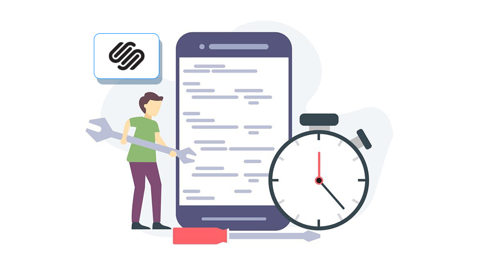
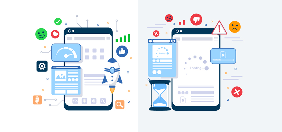
2. Fast-Loading Website
If your site takes too long to load, a pretty design doesn’t mean anything. People who use mobile devices are impatient, so if your Squarespace site doesn’t load quickly, they can leave before they even view your content.
Follow these steps to make Squarespace work better on mobile:
Optimize Your Web Images:
Optimize your images for the Squarespace website by keeping the size of each image under 500KB. This makes sure that your sites load swiftly even on mobile networks that are slower.
Reduce code:
Don’t use a lot of custom code; instead, use Squarespace’s built-in capabilities. Bloated code slows down mobile performance.
AMP for Blog Pages:
Squarespace lets you use Accelerated Mobile Pages (AMP) for blog pages. AMP takes the designs to the basics, but it loads super quickly, encouraging visitors to stay longer and read instead of bouncing back.
Keep the Page Size Smaller:
For the best mobile performance, try to keep the whole page weight under 5MB.
When you prioritize Squarespace mobile performance optimization, you will not only make a user-friendly website but also earn search engine trust.
3. Keep the Navigation Simple
Another important part of a mobile-optimized Squarespace website is navigation. Users get frustrated when menus are too complicated or filled. It looks more confusing on small screens like mobile devices since it makes it difficult for them to navigate.
Squarespace simplifies this by automatically converting your desktop navigation into a mobile-friendly format:
Hamburger Menu:
On mobile, Squarespace turns your navigation into a “hamburger” icon, which is three horizontal lines in the corner. When you tap it, a dropdown menu appears that saves space and keeps your design neat.
Pop-up Mobile Menu:
The hamburger menu turns into a full-screen or pop-up menu that is easy to navigate on smaller devices.
Customized Menu:
You can change your Squarespace mobile menu to fit your brand’s style and the needs of your users. Also, you can change the font sizes, colors, or even add buttons that assist people in taking action inside your mobile navigation.
Visitors won’t get lost if navigation is clear and simple. This will help you make your Squarespace website mobile-friendly and increase engagement.
Best Ways to Optimize Squarespace Website for Mobile in 2025
Here are the best practical ways to optimize Squarespace website for mobile. You can opt to enhance your conversion and user experience:
1. Understand User-Behaviour and Conversion Pattern
People who use mobile devices act substantially differently from people who use desktops. They scan faster, have shorter attention spans, and like CTAs that are easy to tap on and understand. To make your Squarespace site work well on mobile, break up the information into short, easy-to-read parts, use sticky buttons for bookings and offers, and focus on calls to action that are tailored to mobile.
Running A/B tests on mobile and desktop helps you figure out what makes people convert, making sure your site is set up for engagement and making Squarespace websites better for mobile.
2. Improve Accessibility Manually
Squarespace is a nice place to start, but if you want to make your Squarespace website entirely mobile-friendly, you’ll need to do some work on your own:
Mention Alt Text On Every Image:
It adds descriptive text to images so that screen readers can understand them, it helps with SEO, and it makes sure that content remains available even if images don’t load on mobile.
Ensure a Contrast Ratio of 4.5:1:
High contrast between the text and the background will make the content more readable on every screen type. Moreover, it helps visually impaired people navigate easily.
Maintain Keyboard and Tap Navigation:
It should be easy to tap or navigate buttons, links, and menus using a keyboard, preventing frustration and improving usability on touchscreen and assistive devices.
Don’t Use Text Over Photos Without Overlays:
Text on top of images might be hard to read on mobile devices. Using overlays or solid backgrounds enhances clarity and the overall user experience.
3. Improve Readability and Navigation
Readability is an important step in Squarespace mobile optimization. Improve this by:
Font Size:
For body text, use at least 16px so that mobile users can read it without zooming in. The right font size makes things easier to read, improves user experience, and keeps visitors interested.
Buttons:
Make sure buttons are full-width and large enough to ensure easy tapping on mobile screens. This stops people from clicking on things by mistake, improves usability, and encourages them to interact with your CTAs.
Spacing:
Instead of using spacer blocks, use padding that is the same all around elements. Proper spacing keeps the layout tidy, stops clutter, and makes sure that content is visually structured on all sizes of mobile screens.
Easier Navigation:
Menus should be short and easy to understand. Mobile users want quick access to crucial pages; thus, making the menu less complicated makes it easier to use, less frustrating, and helps with Squarespace mobile optimization.
Following these tips can help you make your Squarespace site easier to use on mobile devices and less frustrating for visitors.
4. Optimize Squarespace loading Time
Speed is one of the greatest challenges with mobile. People leave websites that take a long time to load. To improve Squarespace mobile performance, focus on:
Image Optimization:
To make mobile performance and the user experience better, compress images to less than 500KB to speed up load times without losing quality.
Responsive Images:
Use Squarespace’s responsive image blocks to make sure that images automatically scale for different devices. This will make sure that they look clear and load quickly on mobile screens.
Custom Thumbnails:
Use custom thumbnails instead of videos that load automatically to stop large files from downloading, which will speed up pages and make them better for mobile users.
These practices of Squarespace mobile speed optimization will improve Core Web Vitals significantly.
5. Avoid Spacer Blocks
Spacer blocks make it very hard to optimize Squarespace for mobile:
- They typically become hidden on mobile, breaking up layouts.
- They interrupt the consistency of white space across devices.
Use padding and margin settings instead of spacers. This makes sure that when you make your Squarespace site better for mobile, the design seems planned, not broken.
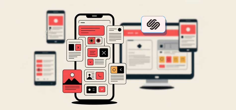
6. Pick a Mobile-Responsive Template
Not every Squarespace template is the same. Some of the older templates aren’t fully optimized. Choose a mobile-responsive template from the start to make your Squarespace website mobile optimized.
Squarespace 7.1 designs that use Fluid Engine are made to work well on mobile devices, making your design adaptive and flexible.
7. Customize your Mobile Layout
The Fluid Engine editor is one of the best things about Squarespace 7.1
It enables you to:
- Reposition blocks independently from the desktop.
- Create unique mobile designs.
- Preview and edit directly in mobile view.
This feature lets you make your Squarespace website responsive for mobile devices, so you can make a design that is not only responsive but also made for mobile consumers.
8. Optimize Multimedia and Embedded Video Features
Multimedia is useful, but it can make your page load more slowly. To improve Squarespace mobile performance:
- Use compressed video files or host them on external platforms.
- Add custom thumbnails instead of auto-playing videos.
- Avoid large background videos on mobile—they consume bandwidth and slow performance.
For Squarespace mobile speed optimization, it’s important to handle multimedia correctly.
9. Test your Site on Different Devices
Finally, testing is really important. Don’t assume that your mobile view will operate on all devices. To make your Squarespace website work well on mobile devices:
- Try it out on more than one phone and tablet.
- Try Google’s Mobile-Friendly Test (Lighthouse).
- Look at the suggestions for unused CSS, image compression, and scaling fonts.
Testing your Squarespace website often makes sure that you always improve its performance on mobile devices and give your users the best experience possible.
Common Mistakes to Avoid When Optimizing Squarespace for Mobile
- Overloaded Content: Mobile visitors want concise and meaningful content.
- Depending only on Desktop Design: What works on desktops may not function properly on mobile. Optimize for both devices.
- Ignoring Accessibility: Not caring about accessibility impacts usability and SEO.
- Skipping Regular Testing: Devices and browsers vary widely; a website will not work the same on every device, so keep regular testing.
Not repeating these mistakes will ensure that your attempts at Squarespace mobile optimization genuinely pay off.
Conclusion
How well you optimize your Squarespace website for mobile will determine how well you do online in 2025. With Google’s mobile-first indexing and user behavior dominated by mobile traffic, businesses can’t afford to ignore this shift.
You can ensure the best user experience by focusing on Squarespace mobile optimization, making it easier to read, faster, and easier to navigate, and customizing layouts using Fluid Engine. When you want to optimize your Squarespace website for mobile, every detail counts, from testing it on different devices to making sure that photos and videos load quickly.
Brands that use Squarespace mobile speed optimization will not only get higher search ranks, but they will also get more sales and trust from their users. Keep in mind that a Squarespace website that works well on mobile devices is what really makes a business successful in 2025.
FAQs
Q1. Why is Mobile Optimization Important for the Squarespace Website?
Q2. What can I do to make my Squarespace site Mobile-Friendly?
Q3. Can Mobile Optimization Improve Squarespace SEO?
Q4. How can I Reduce Bounce Rates on my Squarespace mobile website?
Q5. Does Squarespace Automatically Optimize my Website for mobile?
About the Author