


Introduction
In today’s competitive and growing digital landscape, where mobile internet usage has overtaken desktops, having a fast and optimized mobile website is essential for every online business. A slow mobile site can hinder user engagement and lead to high bounce rates, and negatively impact your search engine rankings.
Optimizing your website for mobile friendliness can be overwhelming and challenging for you. However, it can be managed by using the right strategies and tools in a precise way. Your mobile website speed can effectively improve conversion rates and core web vitals.
Therefore, to reduce your burden and guide you in the right direction, we will inform you about the process of testing and optimizing your mobile website speed, explain why mobile optimization is crucial, and discuss strategies to boost website speed for mobile to provide a better user experience and increase conversions.
Why Mobile Optimization is Necessary and Different From Desktop?
Mobile optimization is essential for any website or application that aims to provide a seamless user experience. The necessity of mobile optimization derives from the growing prevalence of mobile devices; with smartphones and tablets now accounting for a significant portion of web traffic, businesses must ensure their online presence is optimized for these devices.
Here is why mobile optimization is necessary and how it differs from desktop optimization.
1. Increasing Mobile Traffic
Mobile devices now account for a substantial portion of web traffic. According to Statista, as of 2023, mobile devices generate over 55% of global website traffic. With such a significant portion of users accessing websites via mobile, optimizing for mobile is crucial to ensure that this large audience has a positive experience.
In 2023, Google reported that mobile search traffic had surpassed desktop traffic, which emphasized the need for mobile-first design. Companies that ignored mobile optimization faced an intense decline in user engagement and conversion rates.
2. User Experience and Engagement
Mobile users expect a seamless, responsive experience tailored to their devices. A website that is not optimized for mobile can lead to frustrating navigation issues, longer load times, and difficulty reading content, which can deter users and increase bounce rates.
A study by Tooltester revealed that 70% of mobile users said that page speed impacts their willingness to stay on a site. For example, Amazon found that every 100ms increase in load time resulted in a 1% decrease in sales, highlighting the importance of mobile optimization for user satisfaction and business revenue.
3. Search Engine Optimization (SEO)
Search engines like Google also favor mobile-friendly websites in their search rankings. Google’s mobile-first indexing means that the mobile version of a site is considered the primary version for ranking purposes.
According to Google’s 2023 updates, mobile-friendliness has become a significant ranking factor. For example, the website for the online retailer Recreational Equipment, Inc. saw a significant boost in organic search traffic and rankings after implementing a mobile-first design, as reported in a case study by Search Engine Journal.
4. Conversion Rates
Mobile-optimized websites have higher and improved conversion rates than non-optimized sites. Mobile users are more likely to convert if they have a smooth browsing experience.
A case study by Smashing Magazine highlighted that after optimizing their site for mobile, the e-commerce company ASOS saw a 20% increase in mobile conversions. This improvement was attributed to faster load times and a more intuitive mobile design.
Improve Your Website Speed and Performance on Mobile
Boost Speed on Mobile5. Different User Behaviors
Mobile users have different behaviors compared to desktop users, including shorter browsing sessions and more on-the-go searches. Mobile optimization ensures that the site caters to these behaviors effectively.
A 2023 study by Nielsen Norman Group found that mobile users often perform shorter, more focused searches compared to desktop users. Therefore, mobile optimization is essential for a positive user experience.
Effective Tools to Test Your Mobile Website and Page Speed
Testing the speed and performance of your mobile website is crucial for delivering a smooth user experience and maintaining good SEO rankings. Here are 5 effective tools to test your mobile speed.
1 Google PageSpeed Insights
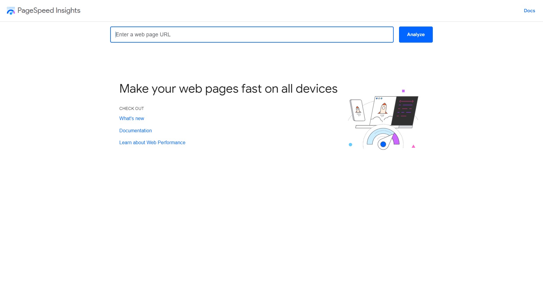
Google PageSpeed Insights analyzes the web page content and provides suggestions to make that page faster. It provides separate scores and recommendations for mobile and desktop versions.
Information Provided:
- Performance Score: A numerical score from 0 to 100 indicates overall performance. Scores are categorized as Good (90-100), Needs Improvement (50-89), and Poor (0-49).
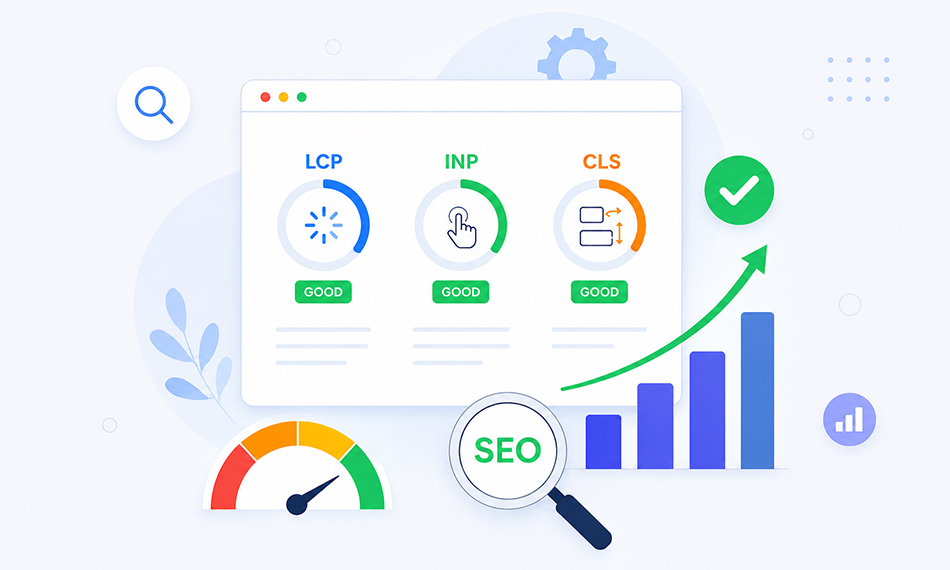
- Core Web Vitals: Metrics like Largest Contentful Paint (LCP), Interaction to Next Paint (INP), and Cumulative Layout Shift (CLS), which measure visual stability, interactivity, and loading performance.
- Opportunities and Diagnostics: Specific recommendations for improvements (e.g., image optimization, minimizing render-blocking resources) and diagnostics to help identify potential issues affecting speed.
2. GTmetrix

GTmetrix offers a thorough analysis of your website’s performance. It combines data from Google Lighthouse and Web Vitals to give a comprehensive view of mobile and desktop performance.
Information Provided:
- Performance Scores: Metrics such as PageSpeed Score and YSlow Score, along with overall performance ratings.
- Page Speed and YSlow Recommendations: Detailed suggestions for optimization based on PageSpeed and YSlow rules.
- Core Web Vitals: Insights into LCP, INP, and CLS.
- Historical Data: Ability to track performance over time with historical graphs.
3. Pingdom Website Speed Test

Pingdom offers a straightforward approach to website speed testing, focusing on user experience and making practical recommendations for improvement.
Information Provided:
- Performance Grade: An overall grade for your website’s performance, along with a numerical score.
- Load Time Breakdown: Detailed information on how long it takes for your page to load, including load time, page size, and number of requests.
- Performance Insights: Recommendations on how to improve load times, such as optimizing images, reducing server response times, and leveraging browser caching.
- Waterfall Chart: A visual breakdown of all the elements on your page and how long each one takes to load.
4. WebPageTest
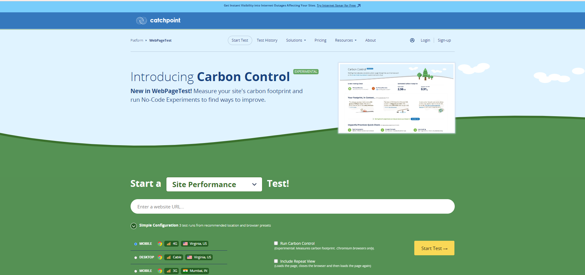
WebPageTest allows for in-depth performance testing from different locations and devices, including mobile simulators. It offers a detailed analysis of how your site performs in various scenarios.
Information Provided:
- Performance Metrics: Includes load time, start render time, and document complete time.
- Core Web Vitals: Detailed information on metrics like LCP, INP, and CLS.
- Waterfall Chart: A detailed view of how each component of your page loads, with timings and potential bottlenecks.
- Mobile Emulation: Testing results for mobile devices with different network conditions (e.g., 3G, 4G) and devices.

Want to read this blog offline?
No worries, download the PDF version
now and enjoy your reading later…
 Download PDF
 5. Lighthouse (Built into Chrome DevTools)
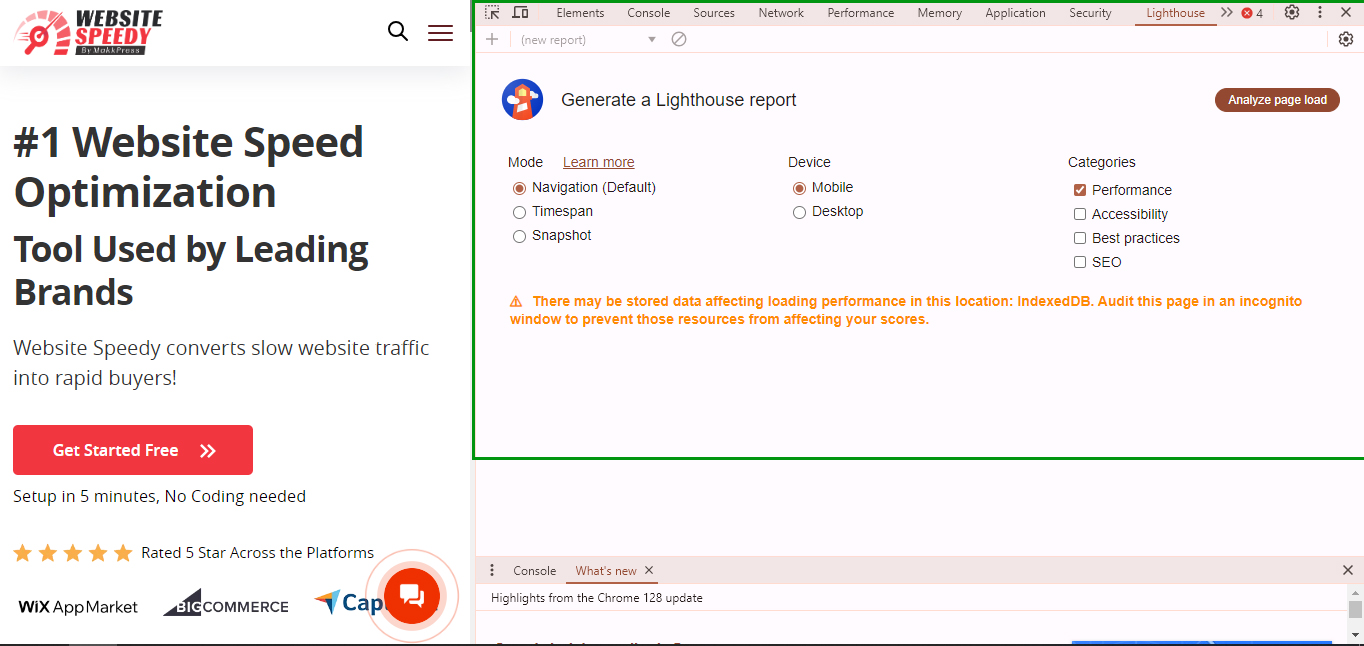
Lighthouse is an open-source tool integrated into Chrome DevTools that provides performance audits, accessibility checks, and SEO evaluations.
Information Provided:
- Performance Score: Overall performance score with a breakdown of key metrics such as LCP, INP, and CLS.
- Performance Metrics: Detailed analysis of loading times, interactivity, and visual stability.
- Best Practices: Recommendations on security, accessibility, and SEO to improve your mobile site’s performance.
- Opportunities and Diagnostics: Specific areas for improvement with actionable advice on reducing load times and optimizing resources.
Things You Must Remember While Testing Your Website For Mobile
To ensure your mobile website performs optimally, follow these straightforward steps to get effective results.
- Test on Different Devices – Check how your website performs across various devices, such as Samsung phones, iPhones, tablets, and different screen resolutions. This ensures a consistent user experience across all mobile platforms. For example, use the device selection dropdown menu in WebPageTest to simulate performance on different devices, including iPhones, tablets, and Google Pixel models.
- Test on Different Network Conditions – Evaluate various network conditions, like 4G or 5G speeds, by adjusting network throttling settings. It helps you understand how your site performs under different connection speeds. Similarly, run tests from various geographical locations to measure how your website performs around the world.
- Run Mobile Tests Regularly – Regularly monitor your website’s performance and key metrics, such as revenue from mobile sales. Consistent testing helps you spot trends and make timely improvements to improve website loading time and mobile performance over time.
- Benchmark Against Competitors – Compare your mobile performance with that of your competitors to identify areas for improvement. Aim to outperform your competitors by offering a superior mobile user experience, which can help you stay ahead in the market.
How To Do Mobile Optimization To Increase Your Conversions?
A mobile-optimized site enhances user experience, improves conversion rates, boosts SEO rankings, and can significantly improve conversion rates.
The simple steps to ensure your website is mobile-friendly are –
1. Adopt Responsive Web Design – Responsive web design ensures that your website automatically adjusts its layout and content to fit various screen sizes. Use flexible grids, images, and CSS media queries to create a fluid layout that adapts to the user’s device. This approach ends the need for separate mobile and desktop versions.
2. Optimize Page Load Speed – Mobile users often have slower internet connections than desktop users. Fast-loading pages are critical to reducing bounce rates and retaining visitors. Compress images, minify CSS, JavaScript, and HTML files, leverage browser caching, and use content delivery networks (CDNs) to speed up load times.
3. Ensure Touchscreen Compatibility – Make sure buttons and links are large enough to be easily tapped with a finger. A good rule of thumb is to make interactive elements at least 44×44 pixels. Avoid placing clickable items too close together to prevent accidental clicks and improve user experience.
4. Simplify Navigation – To keep the interface clean and intuitive, use a mobile-friendly menu, such as a hamburger menu or a bottom navigation bar. You can include a prominent search bar to help users quickly find the content they want.
5. Optimize Forms for Mobile – Make form fields large enough for easy input on a touchscreen. Use appropriate input types (for example – date pickers and number keyboards) to facilitate easier data entry. Ensure labels are clear and visible, and provide concise instructions or error messages to assist users in filling out forms correctly.
6. Use Mobile-Friendly Media – Utilize responsive images that adjust their size according to the screen resolution. Tools like the srcset attribute in HTML help in serving appropriate image sizes. Embed videos in a way that they are playable on mobile devices without requiring additional plugins. Ensure videos are set to be mobile-responsive.
7. Implement Mobile-Friendly Pop-Ups – You must ensure that pop-ups do not cover a significant portion of the screen or hinder user interaction. Opt for smaller, less intrusive pop-ups or banners. Make sure there is a clearly visible and easy-to-use close button for any pop-ups or overlays.
8. Monitor and Analyze Performance – Use analytics tools to monitor mobile traffic, user behavior, and conversion rates. This data helps identify areas for improvement and measure the effectiveness of your mobile optimization efforts. You must collect user feedback to understand their mobile experience and improve website loading time based on their needs and preferences.
How Does Website Speedy Make Your Website Mobile Optimized?
Website Speedy is a robust website optimization tool that performs vital optimization to enhance the user experience on mobile devices. The ways in which website speedy helps your website to get mobile optimized are –
- Faster Page Load Times: Mobile users often face slower connections or use older devices. Website Speedy accelerates your website’s loading time, ensuring quick access to content even under less-than-ideal conditions. It reduces user frustration and keeps visitors engaged.
- Smoother Navigation: Website Speedy improves load times and ensures that interactive elements like buttons, menus, and forms respond swiftly. It is crucial for mobile devices where screen space is limited and precision is vital, offering a seamless browsing experience.
- Reduced Bounce Rates: Mobile users quickly leave a site that takes too long to load. By enhancing your website’s speed, Website Speedy helps retain visitors and reduces bounce rates. A faster site creates a positive first impression and encourages users to explore more pages.
- SEO Benefits: Site speed is a significant ranking factor for search engines like Google. Faster-loading websites are more likely to rank higher in search results, boosting visibility and driving more traffic.
- Improving website speed is fundamental to creating a mobile-first experience because it directly affects how users perceive and interact with a site on their mobile devices. You can also use Website Speedy to improve bigcommerce core web vitals.
Conclusion
Optimizing your mobile website for speed and performance is crucial for maintaining user engagement, reducing bounce rates, and improving search engine rankings. By using the right tools like Google PageSpeed Insights, GTmetrix, and WebPageTest, you can accurately measure and enhance your site’s performance. Implementing responsive design, optimizing load times, and ensuring touchscreen compatibility are key strategies for mobile optimization.
Website Speedy supports mobile optimization by accelerating load times, mastering core web vitals, and boosting SEO rankings. Prioritizing mobile optimization not only enhances user experience but also drives higher conversions and sets your business apart in a competitive market.
Frequently Asked Questions
Q1. Does mobile speed affect SEO?
A. Yes, mobile speed impacts SEO. Search engines prioritize fast-loading sites, especially on mobile, as they enhance user experience. Slow mobile speeds can lead to lower rankings and decreased visibility.
Q2. What is the optimization of mobile?
A. Mobile optimization involves adjusting website design, content, and performance for seamless viewing and functionality on mobile devices. It ensures fast load times, responsive layouts, and easy navigation.
Q3. How can I increase my mobile speed?
A. To increase mobile speed, compress images, use a content delivery network (CDN), minimize code, leverage browser caching, and optimize server response times. These practices reduce load times and improve performance. You can also opt for a website optimization tool like Website Speedy.
Q4. Why is mobile optimization necessary?
A. Mobile optimization is crucial due to the growing use of mobile devices for browsing. It ensures a positive user experience, improves engagement, and enhances search engine rankings, aligning with mobile-first indexing practices.
Q5. How can I check the mobile speed of a website?
A. Use tools like Google PageSpeed Insights, GTmetrix, or Lighthouse to check mobile speed. These tools analyze performance, provide insights, and suggest improvements for faster load times on mobile devices.
Introduction
In today’s competitive and growing digital landscape, where mobile internet usage has overtaken desktops, having a fast and optimized mobile website is essential for every online business. A slow mobile site can hinder user engagement and lead to high bounce rates, and negatively impact your search engine rankings.
Optimizing your website for mobile friendliness can be overwhelming and challenging for you. However, it can be managed by using the right strategies and tools in a precise way. Your mobile website speed can effectively improve conversion rates and core web vitals.
Therefore, to reduce your burden and guide you in the right direction, we will inform you about the process of testing and optimizing your mobile website speed, explain why mobile optimization is crucial, and discuss strategies to boost website speed for mobile to provide a better user experience and increase conversions.
Why Mobile Optimization is Necessary and Different From Desktop?
Mobile optimization is essential for any website or application that aims to provide a seamless user experience. The necessity of mobile optimization derives from the growing prevalence of mobile devices; with smartphones and tablets now accounting for a significant portion of web traffic, businesses must ensure their online presence is optimized for these devices.
Here is why mobile optimization is necessary and how it differs from desktop optimization.
1. Increasing Mobile Traffic
Mobile devices now account for a substantial portion of web traffic. According to Statista, as of 2023, mobile devices generate over 55% of global website traffic. With such a significant portion of users accessing websites via mobile, optimizing for mobile is crucial to ensure that this large audience has a positive experience.
In 2023, Google reported that mobile search traffic had surpassed desktop traffic, which emphasized the need for mobile-first design. Companies that ignored mobile optimization faced an intense decline in user engagement and conversion rates.
2. User Experience and Engagement
Mobile users expect a seamless, responsive experience tailored to their devices. A website that is not optimized for mobile can lead to frustrating navigation issues, longer load times, and difficulty reading content, which can deter users and increase bounce rates.
A study by Tooltester revealed that 70% of mobile users said that page speed impacts their willingness to stay on a site. For example, Amazon found that every 100ms increase in load time resulted in a 1% decrease in sales, highlighting the importance of mobile optimization for user satisfaction and business revenue.
3. Search Engine Optimization (SEO)
Search engines like Google also favor mobile-friendly websites in their search rankings. Google’s mobile-first indexing means that the mobile version of a site is considered the primary version for ranking purposes.
According to Google’s 2023 updates, mobile-friendliness has become a significant ranking factor. For example, the website for the online retailer Recreational Equipment, Inc. saw a significant boost in organic search traffic and rankings after implementing a mobile-first design, as reported in a case study by Search Engine Journal.
4. Conversion Rates
Mobile-optimized websites have higher and improved conversion rates than non-optimized sites. Mobile users are more likely to convert if they have a smooth browsing experience.
A case study by Smashing Magazine highlighted that after optimizing their site for mobile, the e-commerce company ASOS saw a 20% increase in mobile conversions. This improvement was attributed to faster load times and a more intuitive mobile design.
Improve Your Website Speed and Performance on Mobile
Boost Speed on Mobile5. Different User Behaviors
Mobile users have different behaviors compared to desktop users, including shorter browsing sessions and more on-the-go searches. Mobile optimization ensures that the site caters to these behaviors effectively.
A 2023 study by Nielsen Norman Group found that mobile users often perform shorter, more focused searches compared to desktop users. Therefore, mobile optimization is essential for a positive user experience.
Effective Tools to Test Your Mobile Website and Page Speed
Testing the speed and performance of your mobile website is crucial for delivering a smooth user experience and maintaining good SEO rankings. Here are 5 effective tools to test your mobile speed.
1 Google PageSpeed Insights
Google PageSpeed Insights analyzes the web page content and provides suggestions to make that page faster. It provides separate scores and recommendations for mobile and desktop versions.
Information Provided:
- Performance Score: A numerical score from 0 to 100 indicates overall performance. Scores are categorized as Good (90-100), Needs Improvement (50-89), and Poor (0-49).
- Core Web Vitals: Metrics like Largest Contentful Paint (LCP), Interaction to Next Paint (INP), and Cumulative Layout Shift (CLS), which measure visual stability, interactivity, and loading performance.
- Opportunities and Diagnostics: Specific recommendations for improvements (e.g., image optimization, minimizing render-blocking resources) and diagnostics to help identify potential issues affecting speed.
2. GTmetrix
GTmetrix offers a thorough analysis of your website’s performance. It combines data from Google Lighthouse and Web Vitals to give a comprehensive view of mobile and desktop performance.
Information Provided:
- Performance Scores: Metrics such as PageSpeed Score and YSlow Score, along with overall performance ratings.
- Page Speed and YSlow Recommendations: Detailed suggestions for optimization based on PageSpeed and YSlow rules.
- Core Web Vitals: Insights into LCP, INP, and CLS.
- Historical Data: Ability to track performance over time with historical graphs.
3. Pingdom Website Speed Test
Pingdom offers a straightforward approach to website speed testing, focusing on user experience and making practical recommendations for improvement.
Information Provided:
- Performance Grade: An overall grade for your website’s performance, along with a numerical score.
- Load Time Breakdown: Detailed information on how long it takes for your page to load, including load time, page size, and number of requests.
- Performance Insights: Recommendations on how to improve load times, such as optimizing images, reducing server response times, and leveraging browser caching.
- Waterfall Chart: A visual breakdown of all the elements on your page and how long each one takes to load.
4. WebPageTest
WebPageTest allows for in-depth performance testing from different locations and devices, including mobile simulators. It offers a detailed analysis of how your site performs in various scenarios.
Information Provided:
- Performance Metrics: Includes load time, start render time, and document complete time.
- Core Web Vitals: Detailed information on metrics like LCP, INP, and CLS.
- Waterfall Chart: A detailed view of how each component of your page loads, with timings and potential bottlenecks.
- Mobile Emulation: Testing results for mobile devices with different network conditions (e.g., 3G, 4G) and devices.
Want to read this blog offline?
No worries, download the PDF version
now and enjoy your reading later…
Download PDF 5. Lighthouse (Built into Chrome DevTools)
Lighthouse is an open-source tool integrated into Chrome DevTools that provides performance audits, accessibility checks, and SEO evaluations.
Information Provided:
- Performance Score: Overall performance score with a breakdown of key metrics such as LCP, INP, and CLS.
- Performance Metrics: Detailed analysis of loading times, interactivity, and visual stability.
- Best Practices: Recommendations on security, accessibility, and SEO to improve your mobile site’s performance.
- Opportunities and Diagnostics: Specific areas for improvement with actionable advice on reducing load times and optimizing resources.
Things You Must Remember While Testing Your Website For Mobile
To ensure your mobile website performs optimally, follow these straightforward steps to get effective results.
- Test on Different Devices – Check how your website performs across various devices, such as Samsung phones, iPhones, tablets, and different screen resolutions. This ensures a consistent user experience across all mobile platforms. For example, use the device selection dropdown menu in WebPageTest to simulate performance on different devices, including iPhones, tablets, and Google Pixel models.
- Test on Different Network Conditions – Evaluate various network conditions, like 4G or 5G speeds, by adjusting network throttling settings. It helps you understand how your site performs under different connection speeds. Similarly, run tests from various geographical locations to measure how your website performs around the world.
- Run Mobile Tests Regularly – Regularly monitor your website’s performance and key metrics, such as revenue from mobile sales. Consistent testing helps you spot trends and make timely improvements to improve website loading time and mobile performance over time.
- Benchmark Against Competitors – Compare your mobile performance with that of your competitors to identify areas for improvement. Aim to outperform your competitors by offering a superior mobile user experience, which can help you stay ahead in the market.
How To Do Mobile Optimization To Increase Your Conversions?
A mobile-optimized site enhances user experience, improves conversion rates, boosts SEO rankings, and can significantly improve conversion rates.
The simple steps to ensure your website is mobile-friendly are –
1. Adopt Responsive Web Design – Responsive web design ensures that your website automatically adjusts its layout and content to fit various screen sizes. Use flexible grids, images, and CSS media queries to create a fluid layout that adapts to the user’s device. This approach ends the need for separate mobile and desktop versions.
2. Optimize Page Load Speed – Mobile users often have slower internet connections than desktop users. Fast-loading pages are critical to reducing bounce rates and retaining visitors. Compress images, minify CSS, JavaScript, and HTML files, leverage browser caching, and use content delivery networks (CDNs) to speed up load times.
3. Ensure Touchscreen Compatibility – Make sure buttons and links are large enough to be easily tapped with a finger. A good rule of thumb is to make interactive elements at least 44×44 pixels. Avoid placing clickable items too close together to prevent accidental clicks and improve user experience.
4. Simplify Navigation – To keep the interface clean and intuitive, use a mobile-friendly menu, such as a hamburger menu or a bottom navigation bar. You can include a prominent search bar to help users quickly find the content they want.
5. Optimize Forms for Mobile – Make form fields large enough for easy input on a touchscreen. Use appropriate input types (for example – date pickers and number keyboards) to facilitate easier data entry. Ensure labels are clear and visible, and provide concise instructions or error messages to assist users in filling out forms correctly.
6. Use Mobile-Friendly Media – Utilize responsive images that adjust their size according to the screen resolution. Tools like the srcset attribute in HTML help in serving appropriate image sizes. Embed videos in a way that they are playable on mobile devices without requiring additional plugins. Ensure videos are set to be mobile-responsive.
7. Implement Mobile-Friendly Pop-Ups – You must ensure that pop-ups do not cover a significant portion of the screen or hinder user interaction. Opt for smaller, less intrusive pop-ups or banners. Make sure there is a clearly visible and easy-to-use close button for any pop-ups or overlays.
8. Monitor and Analyze Performance – Use analytics tools to monitor mobile traffic, user behavior, and conversion rates. This data helps identify areas for improvement and measure the effectiveness of your mobile optimization efforts. You must collect user feedback to understand their mobile experience and improve website loading time based on their needs and preferences.
How Does Website Speedy Make Your Website Mobile Optimized?
Website Speedy is a robust website optimization tool that performs vital optimization to enhance the user experience on mobile devices. The ways in which website speedy helps your website to get mobile optimized are –
- Faster Page Load Times: Mobile users often face slower connections or use older devices. Website Speedy accelerates your website’s loading time, ensuring quick access to content even under less-than-ideal conditions. It reduces user frustration and keeps visitors engaged.
- Smoother Navigation: Website Speedy improves load times and ensures that interactive elements like buttons, menus, and forms respond swiftly. It is crucial for mobile devices where screen space is limited and precision is vital, offering a seamless browsing experience.
- Reduced Bounce Rates: Mobile users quickly leave a site that takes too long to load. By enhancing your website’s speed, Website Speedy helps retain visitors and reduces bounce rates. A faster site creates a positive first impression and encourages users to explore more pages.
- SEO Benefits: Site speed is a significant ranking factor for search engines like Google. Faster-loading websites are more likely to rank higher in search results, boosting visibility and driving more traffic.
- Improving website speed is fundamental to creating a mobile-first experience because it directly affects how users perceive and interact with a site on their mobile devices. You can also use Website Speedy to improve bigcommerce core web vitals.
Conclusion
Optimizing your mobile website for speed and performance is crucial for maintaining user engagement, reducing bounce rates, and improving search engine rankings. By using the right tools like Google PageSpeed Insights, GTmetrix, and WebPageTest, you can accurately measure and enhance your site’s performance. Implementing responsive design, optimizing load times, and ensuring touchscreen compatibility are key strategies for mobile optimization.
Website Speedy supports mobile optimization by accelerating load times, mastering core web vitals, and boosting SEO rankings. Prioritizing mobile optimization not only enhances user experience but also drives higher conversions and sets your business apart in a competitive market.
Frequently Asked Questions
Q1. Does mobile speed affect SEO?
A. Yes, mobile speed impacts SEO. Search engines prioritize fast-loading sites, especially on mobile, as they enhance user experience. Slow mobile speeds can lead to lower rankings and decreased visibility.
Q2. What is the optimization of mobile?
A. Mobile optimization involves adjusting website design, content, and performance for seamless viewing and functionality on mobile devices. It ensures fast load times, responsive layouts, and easy navigation.
Q3. How can I increase my mobile speed?
A. To increase mobile speed, compress images, use a content delivery network (CDN), minimize code, leverage browser caching, and optimize server response times. These practices reduce load times and improve performance. You can also opt for a website optimization tool like Website Speedy.
Q4. Why is mobile optimization necessary?
A. Mobile optimization is crucial due to the growing use of mobile devices for browsing. It ensures a positive user experience, improves engagement, and enhances search engine rankings, aligning with mobile-first indexing practices.
Q5. How can I check the mobile speed of a website?
A. Use tools like Google PageSpeed Insights, GTmetrix, or Lighthouse to check mobile speed. These tools analyze performance, provide insights, and suggest improvements for faster load times on mobile devices.
About the Author