


TL;DR: Critical CSS improves website speed by eliminating render-blocking styles and allowing above-the-fold content to load instantly. A properly implemented critical CSS leads to faster FCP, improved LCP, fewer layout issues, and better PageSpeed scores. Discover how to implement it safely without breaking your page layout.
In today’s fast-paced web, users expect pages to load almost instantly, particularly the content “above the fold” (what appears on screen without scrolling). One effective method for delivering content quickly is critical CSS: extracting only the CSS needed to render the initial viewport, loading it immediately, and deferring the rest.
However, many developers fear that improper critical CSS implementation may “break” page layouts or cause visual glitches. In this guide, explore how to implement CSS properly without breaking layout and avoid pitfalls, improving both user experience and performance.
What is Critical CSS?
At its core, critical CSS (also called “critical-path CSS” or “above-the-fold CSS”) refers to the minimal set of CSS rules required to render the portion of the webpage visible to the user immediately after page load, the “above-the-fold” content.
By inlining those essential styles directly in the HTML
(instead of waiting for an external stylesheet download), you eliminate or reduce the render-blocking effect of CSS on the “critical rendering path.” The remainder of the styles for below-the-fold content, dynamic widgets, or less-critical components can then be loaded asynchronously or deferred.This approach ensures that the first meaningful content appears quickly for users, even if the rest of the site’s styling loads later, a clear win for perceived performance.
How to Test Critical CSS Properly?
Before diving into implementation, robust testing is essential. Some of the most reliable methods:
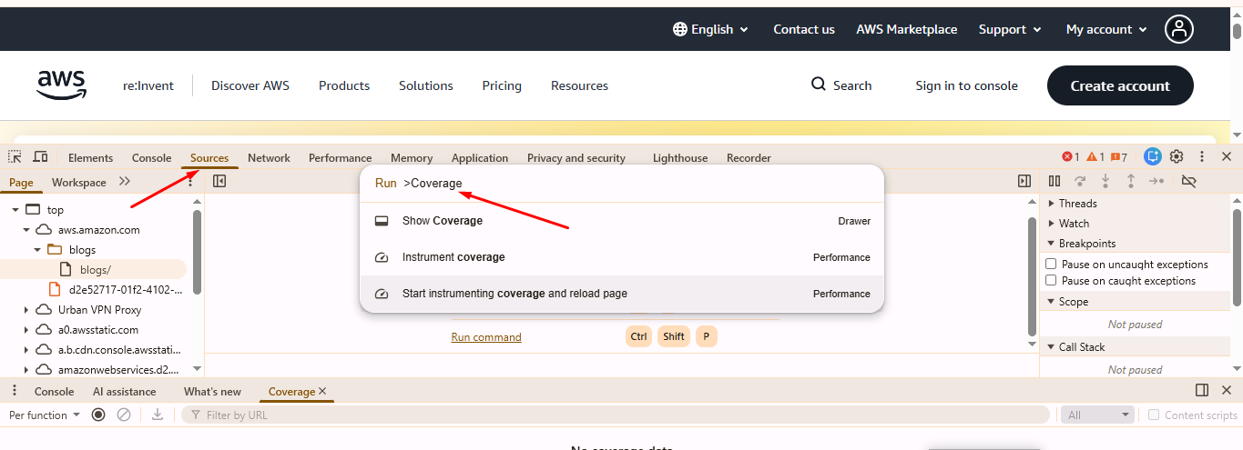
- Use developer tools (e.g., Chrome DevTools + Coverage tab) to identify used vs unused styles after full load. Coverage only shows usage after full rendering, not strictly above-the-fold-only usage. Complement it with viewport-based testing.
- Perform a performance audit (e.g., using Lighthouse) with emulated network throttling (e.g., slow 3G / high latency) to see the real-world impact of CSS delivery.
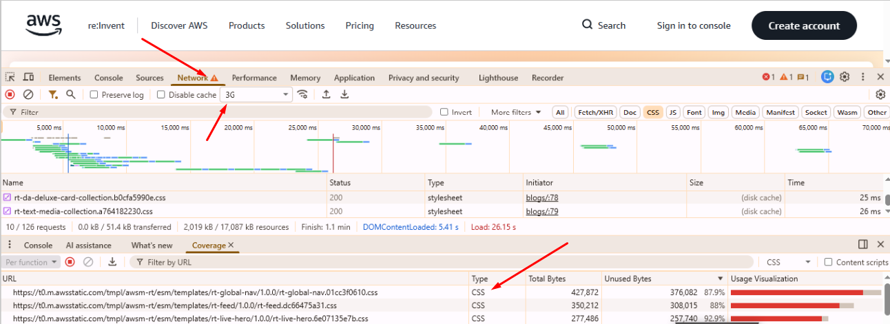
- Use filmstrip view or waterfall charts to visually confirm whether above-the-fold content appears earlier with critical CSS extraction vs. a blank or delayed paint if render-blocking resources are still loaded first.
- Test across multiple viewport sizes (desktop, tablet, mobile), since “above the fold” differs across devices.
- Validate that deferred CSS doesn’t break layout or cause flashes of unstyled content (FOUC) or layout shifts when applied.
Effective testing ensures your critical CSS works correctly across devices and conditions, and reduces the risk of unintended layout issues.
Why Critical CSS Matters for Website Speed?

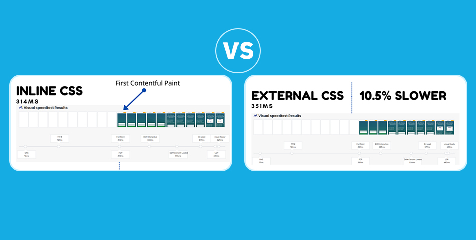
Critical CSS removes render-blocking delays from large external stylesheets, allowing the browser to render above-the-fold content much sooner. As explained by Google, CSS is a render-blocking resource by default, meaning the browser must download and parse it before showing anything on screen.
When implemented correctly, Critical CSS can improve First Contentful Paint (FCP) and Largest Contentful Paint (LCP), only when the LCP element is above the fold (e.g., hero image, headline), though the exact gains vary depending on site complexity, network conditions, and how many other optimizations are in place.
Because Google heavily weighs page experience and Core Web Vitals, particularly LCP, these improvements directly support better rankings and engagement. Faster visual rendering leads to improved conversions and lower bounce rates.
How Critical CSS Implementation Works?
Critical CSS works by extracting only the essential, above-the-fold styles and inlining them directly in the HTML, ensuring the page renders instantly while deferring all non-critical CSS. This is how it typically works:
1. Analyze the page:
Determine which CSS rules are needed to render above-the-fold content (header, hero section, navigation, initial text/images, etc.).
2. Extract and minify those rules:
Using tools that parse the DOM and compute which CSS selectors apply to above-the-fold elements.
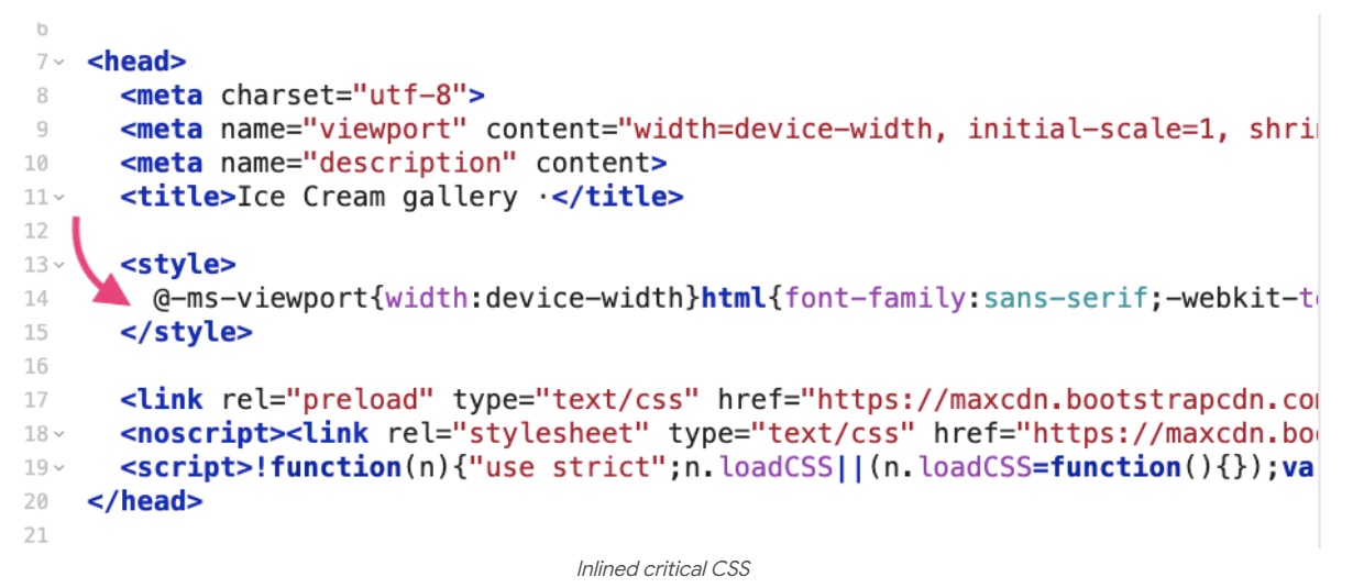
3. Inline CSS:
Inline the extracted CSS into the HTML <head> (inside a <style> tag). This ensures the browser doesn’t need to fetch external CSS before rendering initial content.
4. Defer or asynchronously load the remainder of the CSS:
Either via <link rel=”preload” onload=”…”> pattern or using JS-based CSS loaders, so full styling becomes available after initial rendering without blocking.
<!– Load the main stylesheet asynchronously –>
<link rel=”preload” href=”path/to/your/main-style.css” as=”style” onload=”this.onload=null;this.rel=’stylesheet'”>
<noscript><link rel=”stylesheet” href=”path/to/your/main-style.css”></noscript>
Both patterns work but behave differently, test them to ensure no FOUC on your specific site.
5. Repaint/reflow with full styles once they load:
The page begins styled (for above-the-fold) and then upgrades when full CSS is available. Reflows should be minimal, as large ones indicate that the critical CSS is incomplete.
This process, when performed carefully, balances fast initial rendering with complete styling for the full page, delivering both performance and correctness.
Common Reasons Critical CSS Breaks Page Layouts

Despite the benefits, critical CSS implementation comes with risks. Here are common pitfalls that cause layout issues or “broken” pages:
Over-Inlining too Much CSS:
Including excessive CSS (beyond just above-the-fold) bloats the HTML, delaying overall download and parsing. It also negates caching benefits because every page must re-download that inline CSS.
Web Font Swapping Causing CLS
Incorrect font-display settings or delayed font loading can trigger layout shifts when fallback fonts switch to the final web font. This creates CLS issues, especially when text reflows after the critical CSS has already rendered the initial layout.
Omitting Needed Styles:
If you don’t include CSS for all “above-the-fold” elements (e.g., fonts, grid or layout container rules, initial navigation, header, hero images, etc.), parts of the page may render incorrectly or unstyled until the full CSS loads, causing layout shifting or layout breakage.
CSS Specificity/Ordering Issues:
If deferred CSS overrides (or fails to override) inline critical CSS in an unexpected way or if the order causes reflows, the styling may change or shift.
FOUC or Layout Shifts When Deferred CSS Loads
Deferred CSS can sometimes cause the page to briefly appear unstyled or shift elements when the full stylesheet finally loads. This happens when important layout-related rules are not included in the critical CSS, leading to visible jumps once the remaining styles are applied.
Ignoring Dynamic Content or Alternate Viewports:
Critical CSS tailored for desktop may fail on mobile (and vice versa), or dynamic elements (menus, modals, JS-injected content) may not display correctly until full CSS loads.
Because of these, improper CSS delivery optimization can degrade UX instead of improving it.
Step-by-Step Guide to Implement Critical CSS Without Breaking the Layout

Below is a clear, practical step-by-step procedure you can follow to implement critical CSS without breaking the layout. Each step explains why it matters and how to do it safely.
Step 1: Identify the Critical (Above-the-Fold) Content
What to do: Determine exactly which elements must appear correctly when the page first loads: header/nav, hero area, hero image/text, initial paragraphs, any immediate CTAs, and basic layout containers.
Why it matters: Critical CSS should only contain the rules required to render that initial viewport. Including or excluding the wrong rules either inflates the critical payload or causes parts of the page to render incorrectly.
How to do it: Inspect the page at the typical breakpoints you support (mobile, tablet, desktop) and note which DOM nodes are visible without scrolling.
Step 2: Find which CSS rules those elements use (manual + automated)
Manual (DevTools Coverage): Open Chrome DevTools → Coverage (or Sources → Coverage) while loading the page. The tool highlights unused rules so you can focus on used selectors that apply to above-the-fold content.
Automated: Use extraction tools (e.g., Penthouse, critical, or Critters, integrated into your build) to generate a candidate critical CSS file for the target page/template.
Why both: Manual inspection helps you catch special cases (dynamic classes, JS-injected styles), while automated tools speed up extraction and reduce human error.
Step 3: Prune and Minify the Extracted Critical CSS
What to do: From the set of rules identified in Step 2, remove anything not strictly needed for the initial render (decorative styles, animations that run later, heavy component styles). Then minify the result.
Why it matters: Smaller, focused critical CSS reduces the HTML payload and the time the browser needs to parse the inline styles. Overly large inline CSS negates benefits and can make pages heavier than necessary.
How to do it: Use a CSS minifier (part of most build tools) and check that the resulting rules still produce the intended visual result in the targeted viewports.
Step 4: Inline the Critical CSS Into the
What to do: Place the minified critical CSS inside a <style> tag in the HTML <head>. Keep it as small and focused as possible. Example:
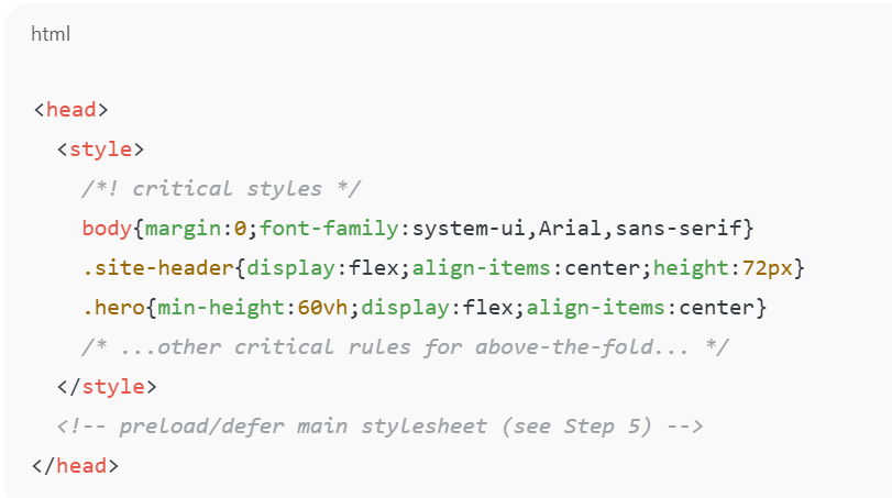
Why it matters: Inlining ensures the browser can apply these styles immediately without waiting for an external download, improving first paint for above-the-fold content.
Step 5: Defer (Load Asynchronously) the Main Stylesheet Safely
Recommended pattern: Use a non-blocking load technique that applies the full stylesheet when ready. A robust pattern is:
<link rel=”stylesheet” href=”/css/main.css” media=”print” onload=”this.media=’all’; this.onload=null;”>
<noscript><link rel=”stylesheet” href=”/css/main.css”></noscript>
Why it matters: The media=”print” prevents the stylesheet from blocking the initial render; onload flips the media to all once the file is loaded, so the full styles apply. The <noscript> fallback guarantees styling for users without JavaScript.
Alternatives: rel=”preload” with onload to change to rel=”stylesheet” is another common approach, choose the pattern that fits your build and cache strategy.
Step 6: Ensure critical CSS contains layout foundations
What to include: For above-the-fold regions, include the layout rules that prevent unstable reflows, container widths/heights, grid/flexbox basics, margins/padding for major blocks, and any baseline typographic rules (font-fallbacks, line-heights).
Why it matters: Missing layout foundations cause content to jump or shift (CLS) when the full stylesheet or webfonts load. Include only what’s necessary to reserve space and preserve initial structure.
Step 7: Handle web fonts and images to avoid layout shifts
Fonts: Critical CSS should NOT preload too many fonts—only necessary ones (usually 1 font-weight). Provide system fallbacks where appropriate.
Images: Reserve intrinsic space for hero images and banners (width/height attributes or CSS aspect-ratio/placeholders) so the browser can allocate layout space before the resource loads.
Why it matters: Fonts and media frequently cause the biggest visible layout shifts; addressing them as part of your critical CSS strategy reduces CLS.
Step 8: Test Across Viewports and Network Conditions
Device testing: Validate the critical CSS on mobile, tablet, and desktop. What’s “above the fold” on mobile is different from desktop, so either generate separate critical CSS per template or ensure the critical block covers the intersection of necessary rules.
Network testing: Use throttling (slow 3G/4G emulation) in Chrome DevTools and run Lighthouse audits to measure FCP, LCP, and identify any remaining render-blocking resources.
Automated visual testing: Consider screenshot comparison or visual regression tests to detect flashes of unstyled content or layout shifts on deployment.
Why it matters: Real-world conditions expose issues automated extraction can miss (dynamic content, late JS modifications, different viewport breakpoints).
Step 9: Monitor and Iterate (Post-deploy Checks)
What to watch: Core Web Vitals (FCP, LCP, CLS) and user metrics from Real User Monitoring (RUM) tools. Watch for any increase in layout shift or user complaints after rolling out critical CSS.
How to respond: If you observe layout regressions, re-examine the critical CSS to add missing layout rules or reduce conflicting inlined styles; verify ordering and specificity between inline rules and the deferred stylesheet.
Why it matters: Continuous monitoring ensures CSS delivery optimization remains stable as the site’s design or component set changes over time.
Step 10: Fallbacks and Edge Cases
No-JS users: Always include a <noscript> link to the full stylesheet so users without JavaScript still receive complete styling.
Dynamic or JS-injected elements: For content that JavaScript injects into the initial viewport (menus, widgets), ensure the necessary basic styles are present in the critical block or reconcile these elements during extraction. Critical CSS usually should not include hover/interactive states
Multiple templates: For multi-template sites, produce per-template critical CSS (or conservative shared critical rules) to avoid missing rules on particular pages.
Following these steps lets you implement critical CSS without breaking layout, the page renders quickly with a stable structure for users, and the full visual polish arrives when the deferred stylesheet finishes loading. The combination of precise extraction, minimal inlining, safe deferred loading, and thorough testing across devices and networks minimizes the risk of layout shift or broken pages.
How to Optimize Critical CSS To Make Your Website Faster

Implementing critical CSS is a strong step, but you can refine the process further for optimal performance:
Split CSS logically:
Separate base layout styles (grid, containers, typography, critical UI components) from decorative or below-the-fold styles. This modular approach simplifies critical-path generation and reduces the risk of missing important styles.
Combine Critical CSS with Other Optimization Techniques:
Minify CSS, remove unused styles (tree-shaking), defer non-critical JS, lazy-load images, preload critical fonts, etc. This holistic CSS delivery optimization improves not just first paint, but overall load and rendering performance. Do not inline animations, transitions, or full component libraries
Use Build Tools or Automation:
For large sites or dynamic build pipelines, integrate critical CSS extraction and inlining (plus deferred loading) into your build process via npm scripts, Webpack/Gulp plugins, or automation services.
Monitor Real-World Metrics (Core Web Vitals):
After implementation, check metrics such as FCP, LCP, and layout stability (CLS) using Lighthouse, PageSpeed Insights, or real-user monitoring tools. Good performance often translates to better user engagement, lower bounce rates, and improved SEO ranking.
With these optimizations layered, critical CSS becomes a powerful lever in your performance toolbox, helping deliver fast, stable, and user-friendly experiences
Inline vs External Critical CSS: Which Is Better?
Whether to inline critical CSS or keep it external (or partly external) depends on context. Here are the pros and cons of each:
Inline Critical CSS
Pros
- Enables immediate rendering of above-the-fold content.
- Eliminates render-blocking for critical styles.
- Removes the need for an additional HTTP request for the first paint.
- Ideal for simple pages or when the critical CSS payload is small.
Cons
- Inline CSS cannot be cached, so it must be downloaded on every page load, which is inefficient for multi-page sites. (ONLY for pages not behind server-level caching)
- Inlining too much CSS can increase HTML size and slow parsing.
- It can become difficult to maintain as the inline block grows.
External (Deferred) CSS for Non-Critical Styles
Pros
- External stylesheets are cacheable, so visitors load them only once.
- Results in a smaller HTML file, improving the initial download time.
- Easier to maintain and update as part of a global CSS workflow.
- Non-critical styles load after the initial render, improving perceived load speed
Cons
- If the stylesheet loads too late, it may cause a Flash of Unstyled Content (FOUC).
- Incomplete or inaccurate Critical CSS extraction can cause temporary layout issues until full CSS loads.
- Requires proper deferring techniques to avoid render-blocking and layout shifts.
Best approach (hybrid): Inline only truly “critical” styles, and defer the rest. Use external stylesheets for full styling, but load them asynchronously or with preload + onload. This strikes a balance between fast initial render and maintainability, ideal for most modern websites.
Conclusion
Implementing critical CSS is more than a technical trick, it’s a strategic optimization for delivering fast, responsive web pages that load quickly and feel smooth to users. When done right, critical CSS implementation can significantly improve perceived load times, reduce render-blocking, and help boost performance metrics like FCP and LCP, all while avoiding layout breakage or visual glitches.
Use critical CSS as part of a broader CSS delivery optimization strategy. Combine it with minification, unused CSS removal, asset lazy-loading, font optimization, and real-user performance monitoring. When orchestrated well, the result is a website that feels fast, stable, and polished, which today’s users expect and search engines reward.
FAQs
Q1: Why does Critical CSS sometimes break pages?
- Essential styles (spacing, layout, fonts) were not included
- Media queries required for above-the-fold elements were omitted
- The full stylesheet loads too late and temporarily overrides layout
- Components rely on JavaScript-injected styles not covered in Critical CSS
Q2: How do you implement Critical CSS without breaking the layout?
To avoid breaking the layout:
- Extract complete above-the-fold styles (spacing + layout + fonts)
- Include responsive media queries affecting the top section
- Inline Critical CSS in the
- Defer the main stylesheet properly using the media="print" loading method
- Test on multiple devices to ensure stability
- Watch for CLS (layout shifts) during load
This ensures the page renders correctly before the full CSS arrives.
Q3: Should Critical CSS be inlined or loaded separately?
- Inline styles render instantly
- They eliminate an extra network request
- They provide immediate styling for the initial viewport
Q4: Does Critical CSS improve Google PageSpeed scores?
- FCP (First Contentful Paint)
- LCP (Largest Contentful Paint)
- TBT (Total Blocking Time)
- "Eliminate render-blocking resources" warning
Q5: How do I test if Critical CSS is working correctly?
- Chrome DevTools → Performance panel (watch for layout shifts)
- Lighthouse / PageSpeed Insights (render-blocking warnings removed)
- WebPageTest Filmstrip View (check for FOUC or delayed styling)
- Disable JavaScript temporarily to ensure fallback works
- Test on a slow 3G network simulation for real bottlenecks
Ishan Makkar
He is a web performance specialist with hands-on experience optimizing websites for speed, media efficiency, and user engagement. As the founder of Website Speedy and Image Optimizer Pro, he has helped businesses across multiple industries improve load times, strengthen SEO, and reduce bounce rates. His work focuses on creating reliable, data-driven optimization solutions that deliver measurable results and build long-term digital trust.