


Introduction
Creating an impressive website design that is responsive is no longer a choice but a necessity to grow in the competitive online market. A website visitor always has hundreds of options to explore, and this is why your website should excel in your aspects. And, having a responsive design is an effective way to boost website speed performance and improve your conversions.
Google also says, “A responsive design makes sure that your site is accessible and functional on all devices, which is important for delivering a positive user experience.”
According to research conducted in 2024, 17% of users abandon their shopping carts because the website has errors and is not responsive. No business wants this to happen to their website, and that is why you must focus on creating a responsive and mobile-friendly website.
Today, we will provide you with a complete guide on how to make your website design user-friendly and why it is necessary. First, let’s briefly understand what a responsive website design is.
What is a Responsive Web Design?
Responsive Web Design is a standpoint that ensures websites function effectively across various devices and screen sizes. It enables designers to apply different styles based on device characteristics such as width, height, and orientation, hence customizing the visual presentation for optimal user experience.
A responsive website design provides a consistent and user-friendly experience across desktops, tablets, and smartphones, which enhances usability and accessibility. Maintaining a single, responsive site is more cost-effective and manageable compared to developing and updating multiple versions for different devices. Responsive design simplifies website management and aligns with modern user expectations for seamless and adaptable digital experiences.
Why Is a Responsive Website Necessary For Your Growth?
1. User-Friendly Experience
A responsive website ensures that users have a seamless experience regardless of the device they use, whether it is a smartphone, tablet, or desktop. The adaptability improves user satisfaction, reduces bounce rates, and increases engagement.
According to Google’s Mobile-Friendly Test data, users are 5x more likely to leave a site if it is not mobile-responsive.
A user-centric design that adjusts to screen sizes offers better interaction and retention, which is necessary for maintaining a positive brand perception and encouraging repeat visits.
2. Fast Speed and Good SEO Rankings
Page speed is a vital element for SEO and user experience. Google prioritizes fast-loading sites in its search rankings, as slow speeds can negatively impact user satisfaction.
Research by Google reveals that 53% of mobile users will abandon a page if it takes more than 3 seconds to load. Also, if we look at Google’s Core Web Vitals update, it also highlights the importance of site speed, with websites that perform well in these metrics having improved rankings and visibility in search engine page results.
3. Over 60% of Mobile Users Are Your Potential Customers
Mobile usage is increasing every day, with over 60% of global web traffic now coming from mobile devices, according to Statista. The significant shift underscores the necessity of a responsive design to cater to a significant portion of your audience.
A site that adapts to mobile screens helps capture and retain these users, which enhances their browsing experience and makes it easier for them to engage with your content or complete a transaction or purchase.
4. Optimized Social Media Advertisements
Responsive websites enhance the effectiveness of social media advertisements. When users click on ads from social platforms, they expect a smooth transition to content that fits their device.
According to HubSpot, responsive designs can improve ad performance by ensuring that landing pages are optimized for all devices. It leads to higher engagement rates and better ROI on advertising spend. Consistent and responsive experiences help retain users and drive them toward conversions.
Improve Your Website Loading Speed With Website Speedy
Make Your Website Fast5. Higher Conversion Rates
Responsive design can significantly improve conversion rates. A Google study found that mobile-friendly sites see a 68% longer visit duration and 49% higher conversion rates compared to non-mobile-friendly sites.
A well-optimized site that adjusts to user devices creates a smoother path to conversion, whether it’s completing a purchase, filling out a form, or subscribing to a newsletter. It ensures that users have a positive experience, regardless of the device they use. A responsive website design leads to increased trust, reduced bounce rates, and higher conversion rates.
Here you can read more about website speed’s impact on conversions
6. Competitive Advantage
Having a responsive website provides a competitive edge in a crowded market. As per a survey by Statista, businesses with mobile-optimized sites see an average revenue increase of 15-30% compared to those without.
A responsive design not only improves user experience but also positions a brand as modern and user-focused, differentiating it from competitors who may lag in mobile optimization. This advantage helps in attracting and retaining customers, leading to sustained growth and market leadership.
Easy Tips To Check If Your Website Is Responsive
Before diving into responsive strategies, you must know whether your website is responsive and what improvements are needed. Here are some tips and tricks for checking your website’s responsiveness.
- Use Web Browser Tools: Most modern browsers have built-in developer tools that can help you test your website’s responsiveness. For example, in Chrome, you can use the “Toggle Device Toolbar” (Ctrl+Shift+M) to simulate different screen sizes and resolutions.
- Utilize Responsive Testing Tools: Several online tools are available, such as BrowserStack, Responsinator, or Mobile-Friendly Test by Google. These tools allow you to enter your website’s URL and view how it appears across different devices and screen sizes.
- Resize the Browser Window: Simply resizing your browser window can help you test responsiveness. Drag the edges of your browser to simulate different screen sizes and see how your website adapts.
- Check Site on Real Devices: While browser tools and online simulators are helpful, testing on actual devices (smartphones, tablets, etc.) provides the most accurate view of how your site performs. Different devices might have unique issues or variations in how they render content.
- Test the “Touch” Elements: Check how touch elements like buttons, links, and interactive features behave on touch screens. Ensure they are easily clickable and appropriately sized for touch interactions.
- Look for Breakpoints: Breakpoints are specific screen widths at which your website’s layout changes to accommodate different devices. Check how your site transitions between different breakpoints (like from desktop to tablet to mobile) to ensure content and design adjust smoothly without breaking or appearing awkward.
Effective Steps To Make Your Website Responsive
There are four key elements that you must focus on to make your website responsive and user-friendly. Optimizing these key building blocks will efficiently make your website responsive.
During the initial stage, it may seem a bit challenging to improve every tiny component. Therefore, here are a few effective ways to help you transform your website without issues.
1. Make Your Images Responsive
Images must adjust to the size of the screen on which they are viewed to ensure that they look great on all devices.
It can be achieved by using CSS techniques like max-width: 100%. Setting an image’s maximum width to 100% of its container scales down for smaller screens while maintaining its aspect ratio. The height: auto property ensures that the image does not get distorted.
Another helpful method is using responsive image techniques with the srcset attribute in HTML. It allows the browser to choose the most appropriate image size based on the device’s screen resolution and dimensions, which helps improve website loading time and enhances user experience.
2. Using a Fluid Grid and Layouts
A fluid grid layout uses percentage-based widths rather than fixed pixel values for layout elements. This approach allows your website’s layout to adapt fluidly to different screen sizes.
Instead of setting a fixed width for columns, you set relative widths, which scale according to the screen size. CSS Grid and Flexbox are modern layout systems that make it easier to create fluid layouts.
For example, using CSS Grid, you can define columns and rows that automatically adjust in size depending on the viewport. It confirms that content remains readable and well-structured. Flexbox, on the other hand, is useful for aligning and distributing space among items in a container, even when their size is unknown or dynamic.
3. Using CSS Breakpoints (Media Query)
CSS breakpoints allow you to apply different styles to your website based on the width (or other characteristics) of the viewport. It ensures that your content looks good across devices, from mobile phones to large desktop monitors.
Breakpoints are defined using media queries in CSS. A media query estimates the size of the device or viewport and applies specific styles if certain conditions are met. For example, you might have a media query that changes the layout when the viewport width is 768 pixels or less, which is common for tablets and mobile devices.
Steps To Identify the Media Query
- Content-Based Breakpoints – Modify styles based on the content’s needs rather than device sizes. For example, if the text becomes too squished or images overlap at certain widths, you can set breakpoints to fix these issues.
- Device-Based Breakpoints – Start with common device widths like 480px for phones, 768px for tablets, and 1024px for desktops. However, avoid relying solely on device sizes as new devices with different screen sizes are constantly introduced.
- Mobile-First Approach – Begin by designing for the smallest screens first, then use media queries to adapt the layout for larger screens. It ensures that your design is optimized for mobile users, who are in the majority.
4. Optimization for Touchscreens
Touchscreen optimization ensures that buttons and clickable elements are appropriately sized and spaced, as small touch targets can be difficult to interact with on a touchscreen. A minimum touch target size of around 44×44 pixels is generally recommended.
Providing enough spacing between interactive elements helps prevent accidental clicks. Including touch-friendly features, such as larger touch areas and swipe gestures, enhances usability. By focusing on these elements, you create a smoother and more intuitive experience for touchscreen users to improve conversion rates.
Common Challenges While Building a Responsive Design
To boost website speed and create a responsive design, you require coding expertise and a specific set of skills. Here are a few challenges with their solutions you may encounter while making your website user-friendly.
1. Visual Rendering Across Devices
Problem: Different screen sizes, resolutions, and orientations can affect how images, text, and layouts appear. For instance, a design that looks perfect on a desktop might appear distorted on a smartphone or tablet due to varying screen dimensions and pixel densities.
Solution: Design your website using a mobile-first approach, first optimizing it for smaller screens. Use vector images (like SVGs) or high-resolution images that scale well on different devices. Implement media queries in your CSS to adjust styles based on the screen size and resolution.
2. Poor Quality Scalable Images
Problem: Using images that do not scale well can result in poor-quality visuals, especially on high-resolution screens or large displays. When stretched or resized, images might appear pixelated or blurry, which affects the overall aesthetics and user experience.
Solution: Opt for scalable image formats like SVG (Scalable Vector Graphics) for icons and illustrations, as they maintain quality regardless of size. For photographs or detailed images, use responsive image techniques such as srcset and size attributes in HTML to select the most appropriate image size based on the device’s screen size and resolution.
3. Impact on Website Performance
Problem: Implementing a responsive design can sometimes negatively impact website performance. The need to load different styles, scripts, and images for various devices may slow down page load times, particularly on mobile devices with slower connections.
Solution: Optimize website performance by minimizing and compressing CSS and JavaScript files and using asynchronous loading techniques. Implement lazy loading for images so they load only when they enter the viewport. You can also use a website speed optimization tool to speed up your website.

Want to read this blog offline?
No worries, download the PDF version
now and enjoy your reading later…
 Download PDF
 4. Requirement of Coding Skills
Problem: Creating a responsive design requires a solid understanding of HTML, CSS, and sometimes JavaScript. For those without coding expertise, implementing responsive features and maintaining cross-device compatibility can be challenging.
Solution: Use responsive design frameworks and libraries like Bootstrap or Foundation, which provide pre-built responsive components and grid systems that simplify development. Consider using website builders with built-in responsive design capabilities if you prefer a no-code approach.
5. Problems Related to Navigation
Problem: Navigation issues can also impact user experience, especially responsive designs. Common issues include menus too small to tap on mobile devices, dropdowns that do not work well on touchscreens, and navigation elements that become hidden or misaligned.
Solution: For mobile devices, use techniques like a hamburger menu or off-canvas menus to keep navigation accessible without taking up too much space. Ensure that navigation elements are touch-friendly by making buttons and links large enough for easy tapping.
Website Speedy is Here To Give You Lightning Fast Website
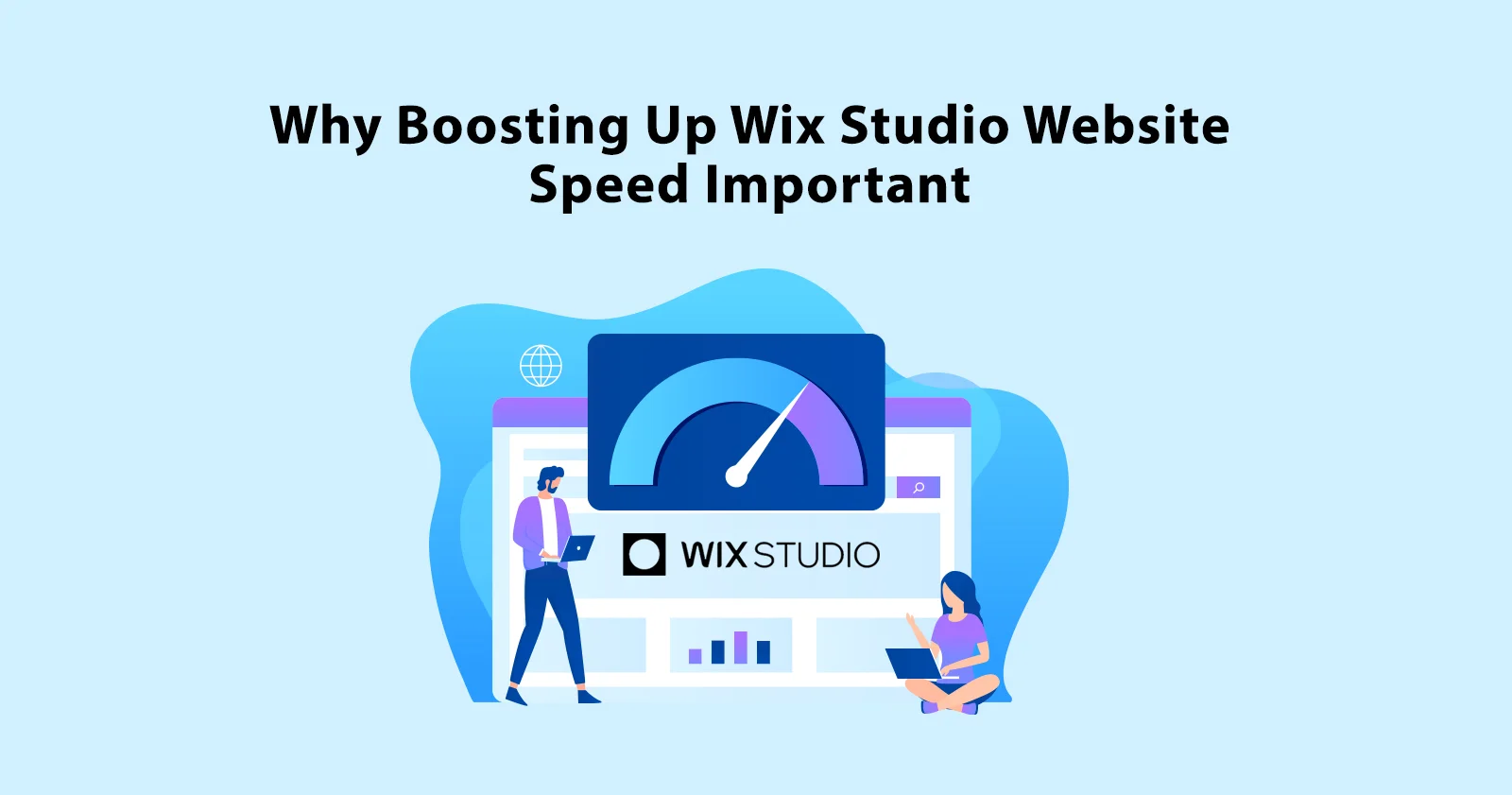
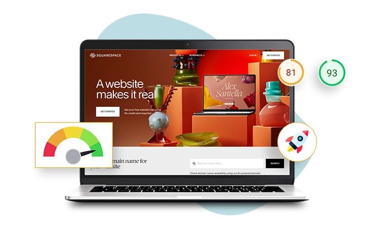
If you are not a skilled coder and want to enhance website speed and make it user-friendly, there is no need to worry. You can always use a tool like Website Speedy for Shopify, Squarespace, or Wix to boost traffic and conversions. It is one of the best tool for Wix website speed optimization.
The ways in which Website Speedy improves your website loading time and performance are –
1. Identifies and Optimizes elements that Block rendering
Website Speedy detects elements that delay page loading by blocking the content display. It optimizes these elements to ensure your website renders quickly and enhances the user experience to reduce bounce rates on your online platform.
2. Implements Lazy Loading
Lazy loading defers the loading of non-essential content until it is needed. This means images and other resources only load as users scroll, which improves website loading time and reduces initial page load.
3. Provides Mobile First Experience
With mobile-first optimization, Website Speedy ensures that your site is designed to perform exceptionally on mobile devices. This approach enhances user experience on smartphones and tablets, aligns it with modern browsing habits and engagement, and improves conversion rates to grow your business.
4. Masters Your Core Web Vitals
Core Web Vitals are essential metrics that measure user experience aspects like loading speed, interactivity, and visual stability. Website Speedy improvises these metrics to boost website speed and performance and positively impact search engine rankings.
5. Optimizes Your Responsive Code
Responsive code confirms that your website adjusts across various devices and screen sizes. Website Speedy refines this code to ensure your site looks and performs well, whether viewed on a desktop, tablet, or smartphone.
Conclusion
A responsive website delivers a seamless user experience across all devices. With over 60% of global web traffic coming from mobile users, optimizing responsiveness is crucial to decrease bounce rates and get a loyal customer base. Website optimization tools like Website Speedy will enhance your website’s performance by addressing elements that impact loading times and core web vitals. Investing in a responsive and fast-loading site translates to higher engagement, lower bounce rates, and increased conversion rates, giving you a competitive edge in the crowded online market.
Frequently Asked Questions
Q1. How can I convert my website to responsive?
A. To make your website responsive, use CSS media queries to adjust the layout for different screen sizes. Implement flexible grid layouts and responsive images that adapt to various devices. Frameworks like Bootstrap can also streamline this process.
Q2. What is the difference between a responsive website and a static website?
A. A responsive website adjusts its layout based on the device’s screen size and orientation, providing an optimal user experience on any device. A static website has a fixed layout that does not adapt, which can lead to poor usability on smaller screens.
Q3. What happens if a website is not responsive?
A. If a website is not responsive, it can be difficult to navigate on mobile devices, which leads to a poor user experience. Users may need to zoom and scroll horizontally, which can increase bounce rates and negatively impact search engine rankings.
Q4. Does Google prefer responsive websites?
A. Yes, Google prefers responsive websites because they offer a better user experience across all devices. Responsive design is also recommended by Google for mobile-friendliness, which can positively improve conversion rates and affect search engine rankings.
Q5. How can I make my website responsive easily?
A. To make your website responsive easily, use a responsive design framework like Bootstrap, which provides pre-designed components and layouts that automatically adjust to different screen sizes. Using a website optimization tool like Website Speedy will also help improve the site’s performance.
About the Author